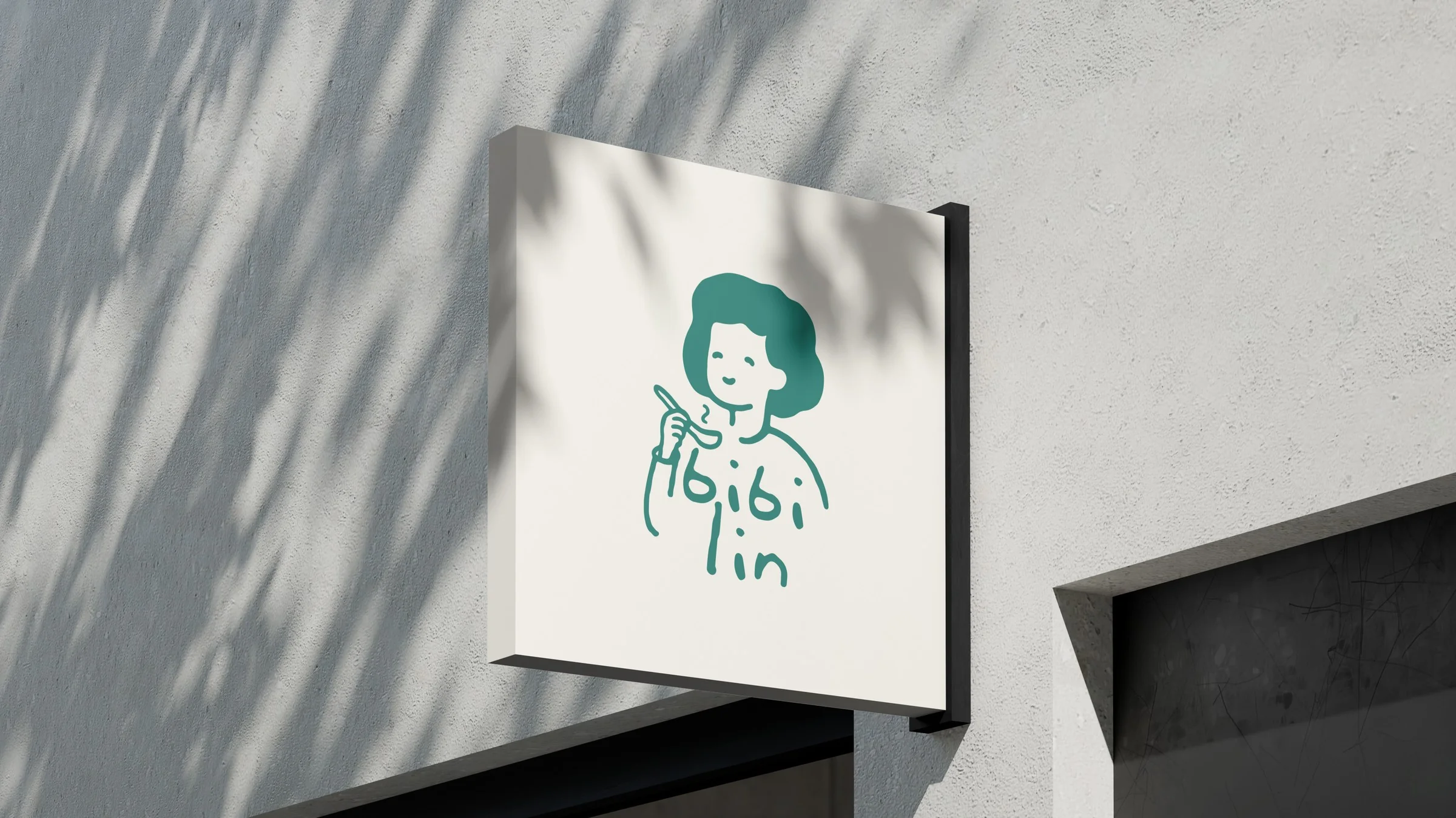
Kedai Bibi Lin serves Hainanese chicken rice with the soul of a modern kopitiam. Peranakan flavors, honest portions, dishes made to be remembered.
Students on a lunch break. Office workers on a quick escape. Young families sharing a moment. Everyone ends up at the same table.
The Character
Bibi Lin is in her 50s. Stylish yet modest, modern but never trying too hard. She knows everyone by name, or makes one up if she doesn't.
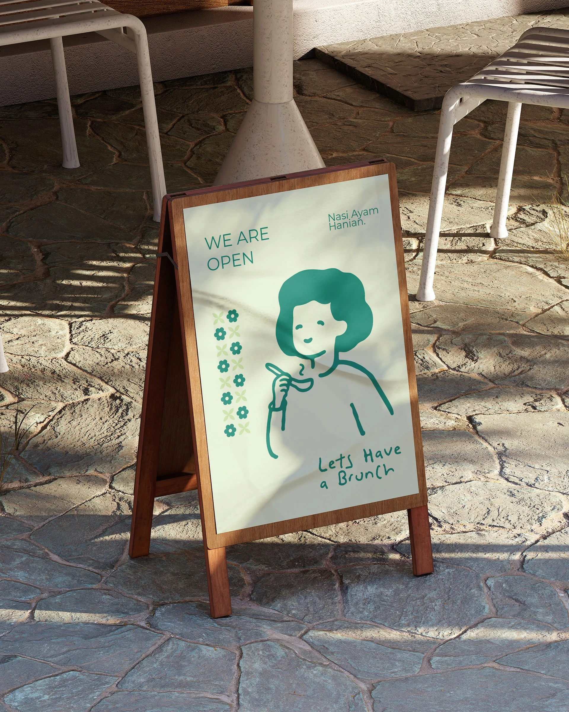
She runs her kitchen like a captain, fast paced but light hearted. Not a mascot. Just a grounded character who feels like home. Not just comfort food. It's Bibi food.
The minimum space around the logo equals the height of the lowercase letter b in bibi. This keeps the mark uncluttered wherever it's placed.
Brand Strategy
Confident in what it offers, never arrogant. The flavor does the talking.
Like an auntie striking up a chat at the kopitiam. Personal and genuine.
A tight kitchen, a clear voice. No fluff, no jargon.
Light hearted with purpose. Never overly cutesy.
Hover or tap each part to see it on the mark.
The soul of the palette. Deep and reassuring. It feels like home.
#227C71Calm and confident. It gives every element room to breathe.
#325E72Playful and handwritten. Used for headlines, brand messages, and packaging. A licensed display font, so no live specimen here.
Clean and highly readable. Used for menus, body copy, and everyday details.
Aa Bb Cc Dd Ee
ABCDEFGHIJKLMNOPQRSTUVWXYZ
abcdefghijklmnopqrstuvwxyz
0123456789
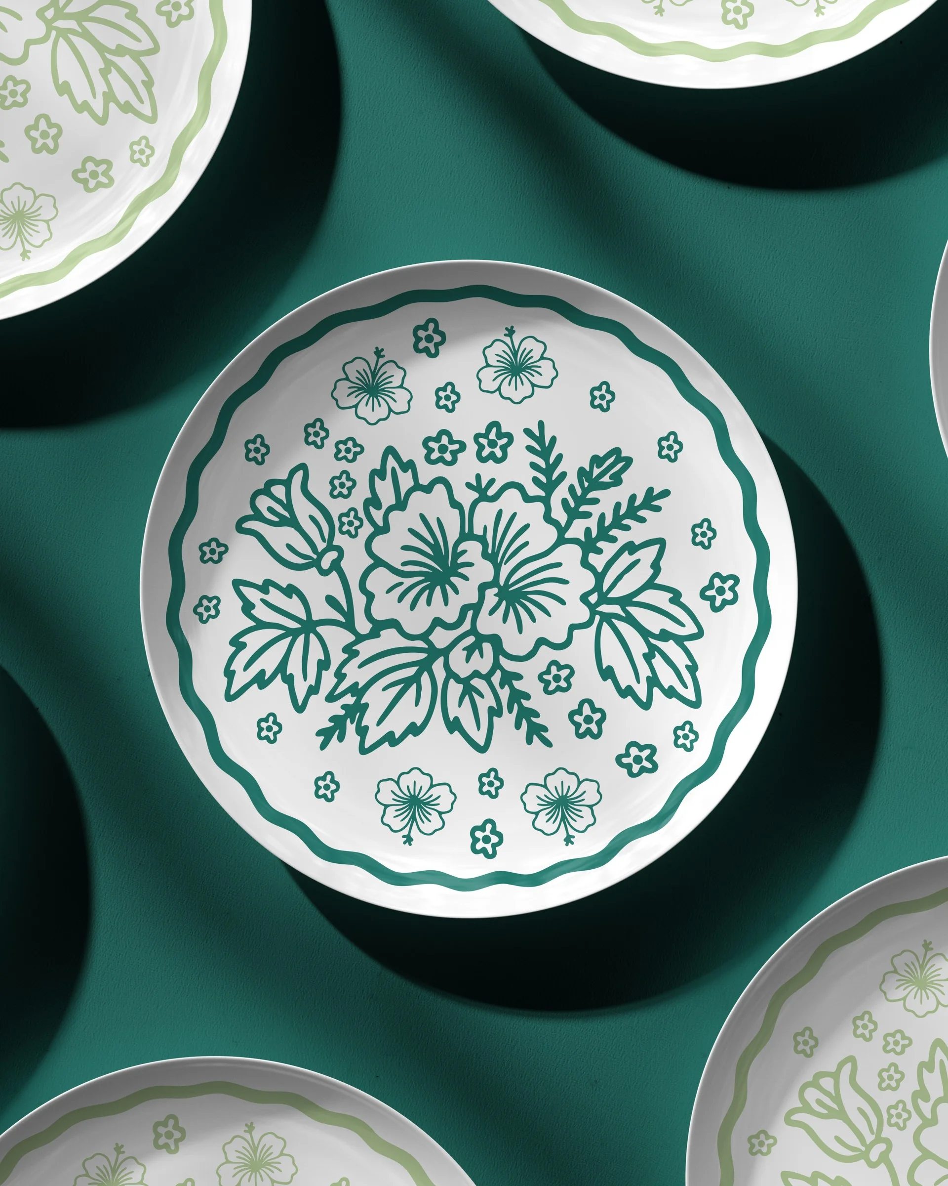
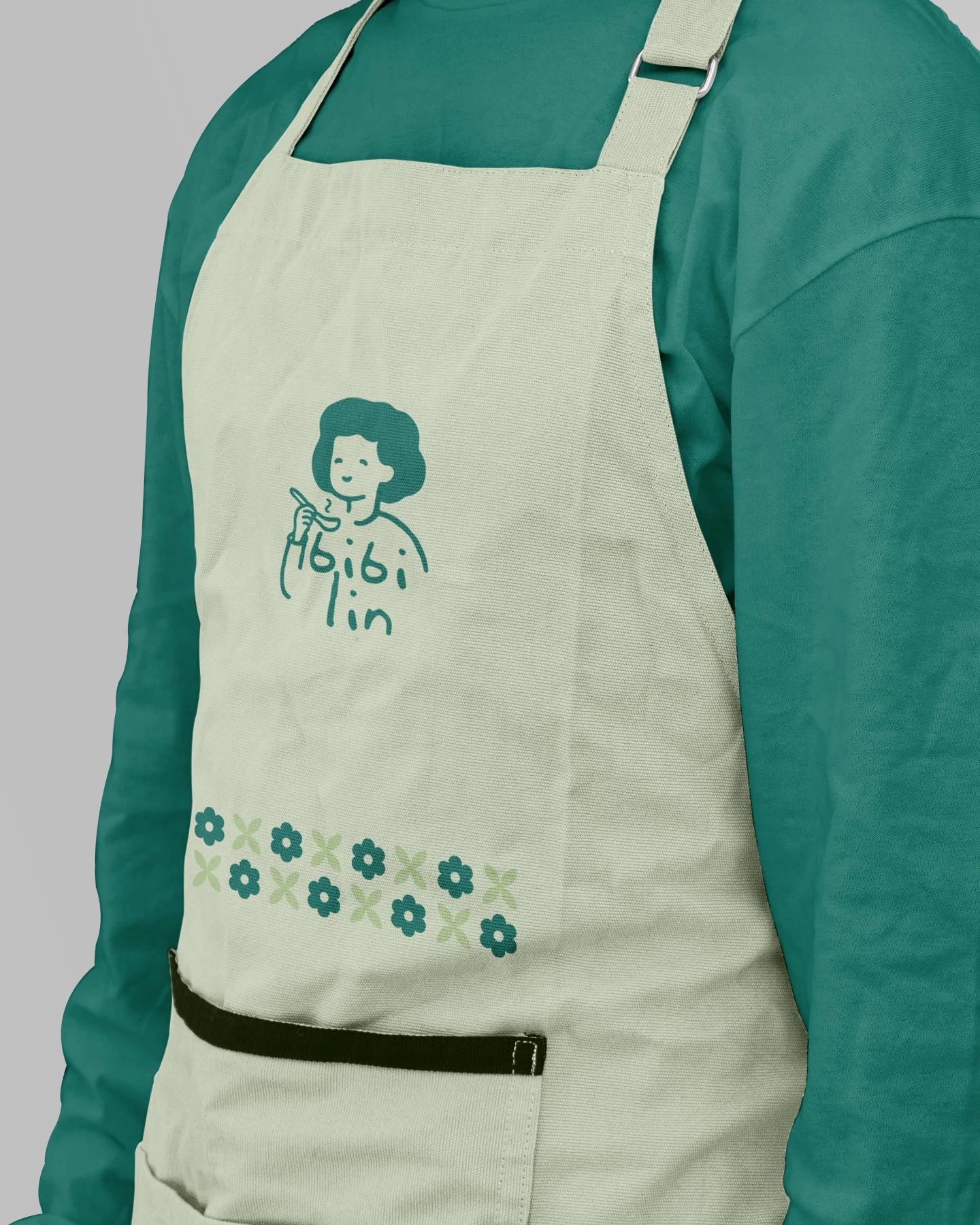
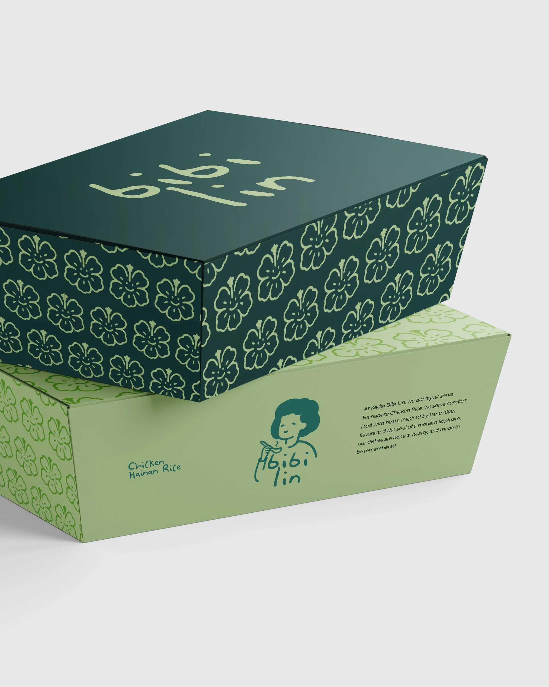
A grid of hand-drawn flowers, one bold, one delicate. The small imperfections keep it feeling human, and the tones echo Bibi Lin's calm, grounded palette.

Next Case Study