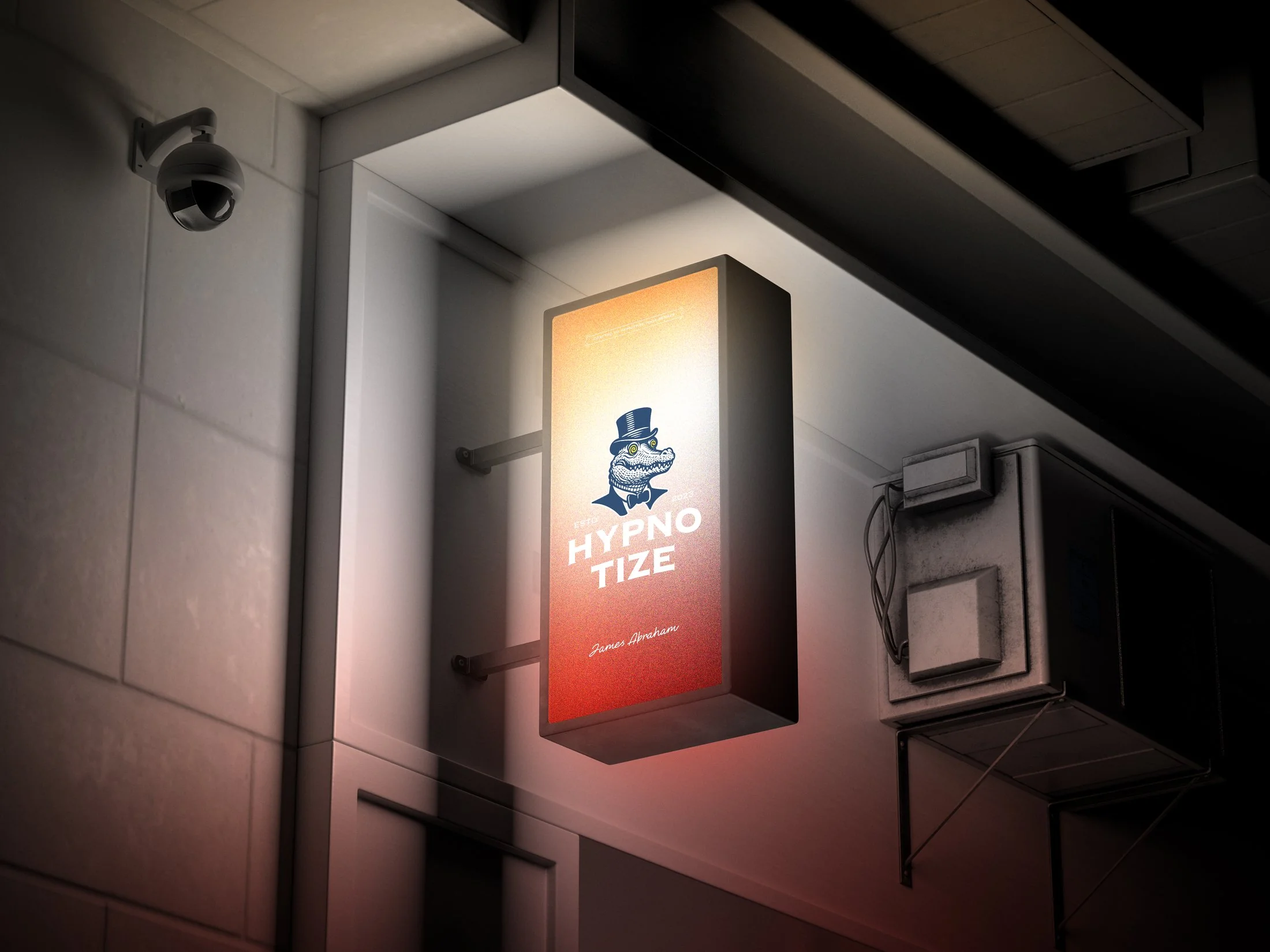
Hypnotize started as a self-directed brief, not a client one. There was no kickoff call — just a name that already suggested theatre, and a blank page underneath it.
The rule I set myself: every decision has to survive both ends of the shelf. Readable as a wall-mounted sign from ten meters away, and just as legible up close on a 40ml sample bottle.
Naming direction, brand world & tone of voice
Five character marks, one per flavor expression
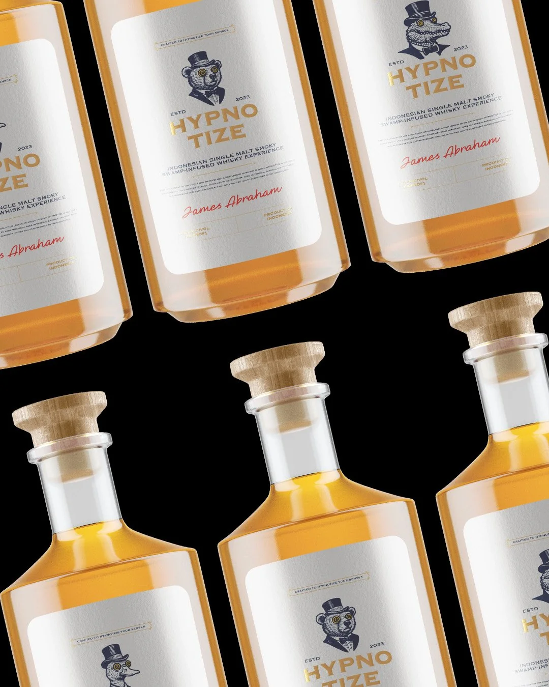
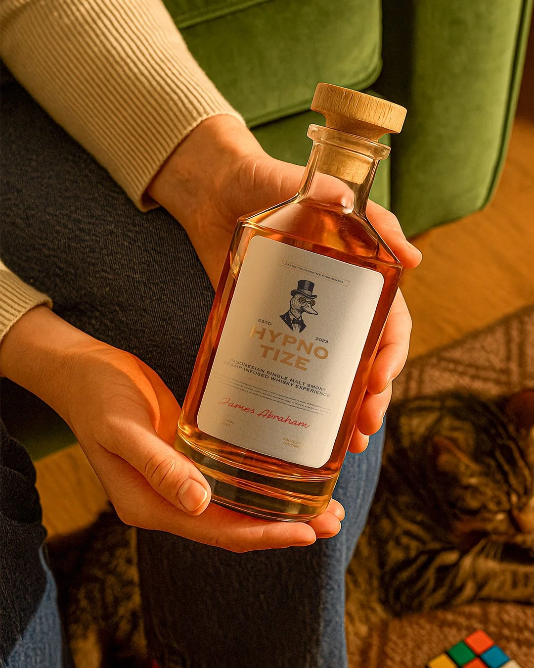
Full label system & bottle packaging
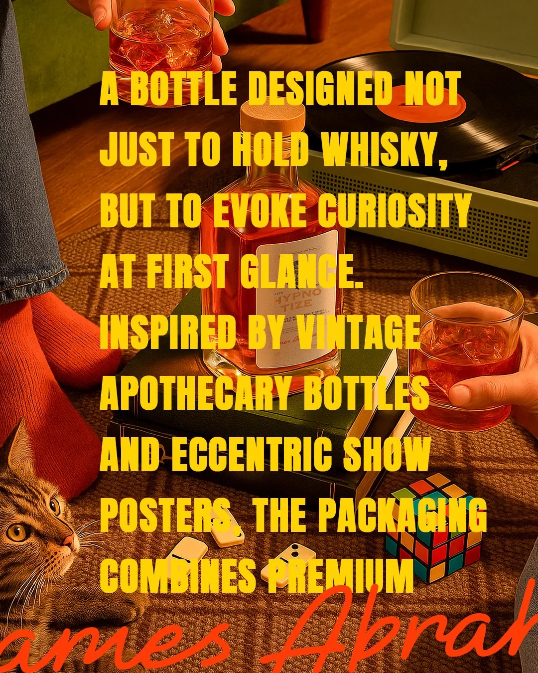
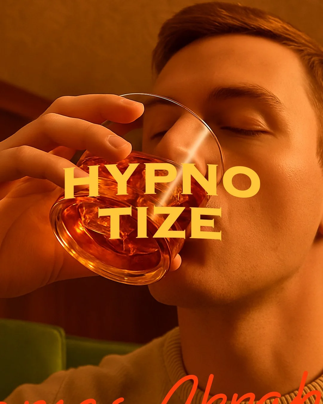
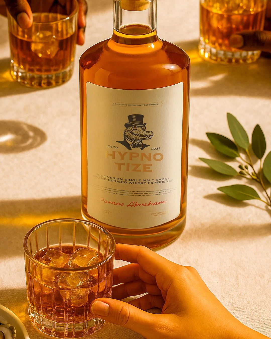
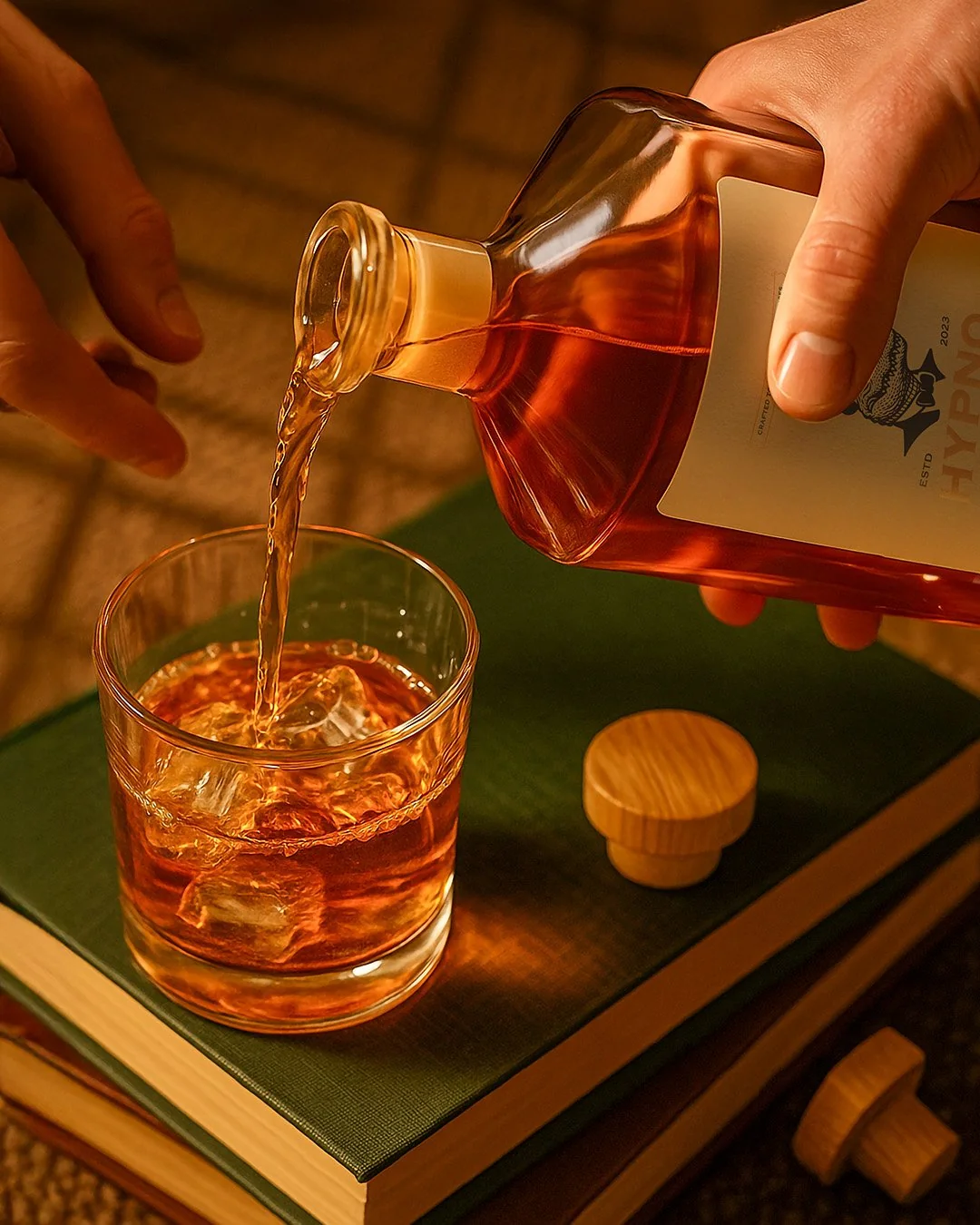
Signage, lifestyle photography direction & a small social campaign
Five animals in top hats and spiral pupils, engraved like an old apothecary label and dressed for a séance in a swamp-side parlor. Vintage carnival energy, held together by disciplined, symmetrical linework.
Theatrical, not loud
Rooted in place
Well dressed
A little surreal
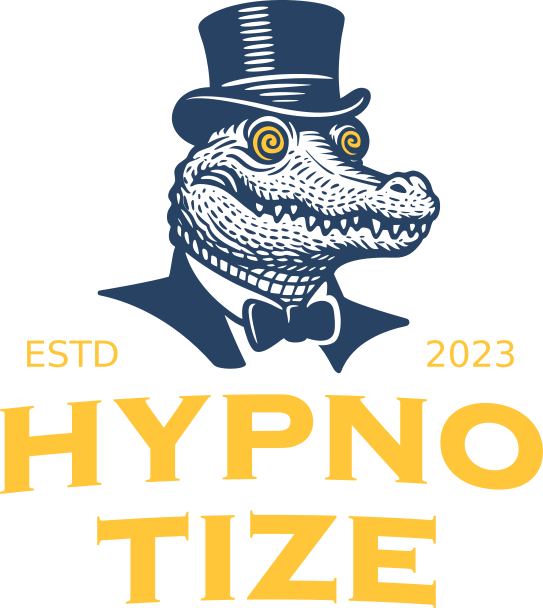
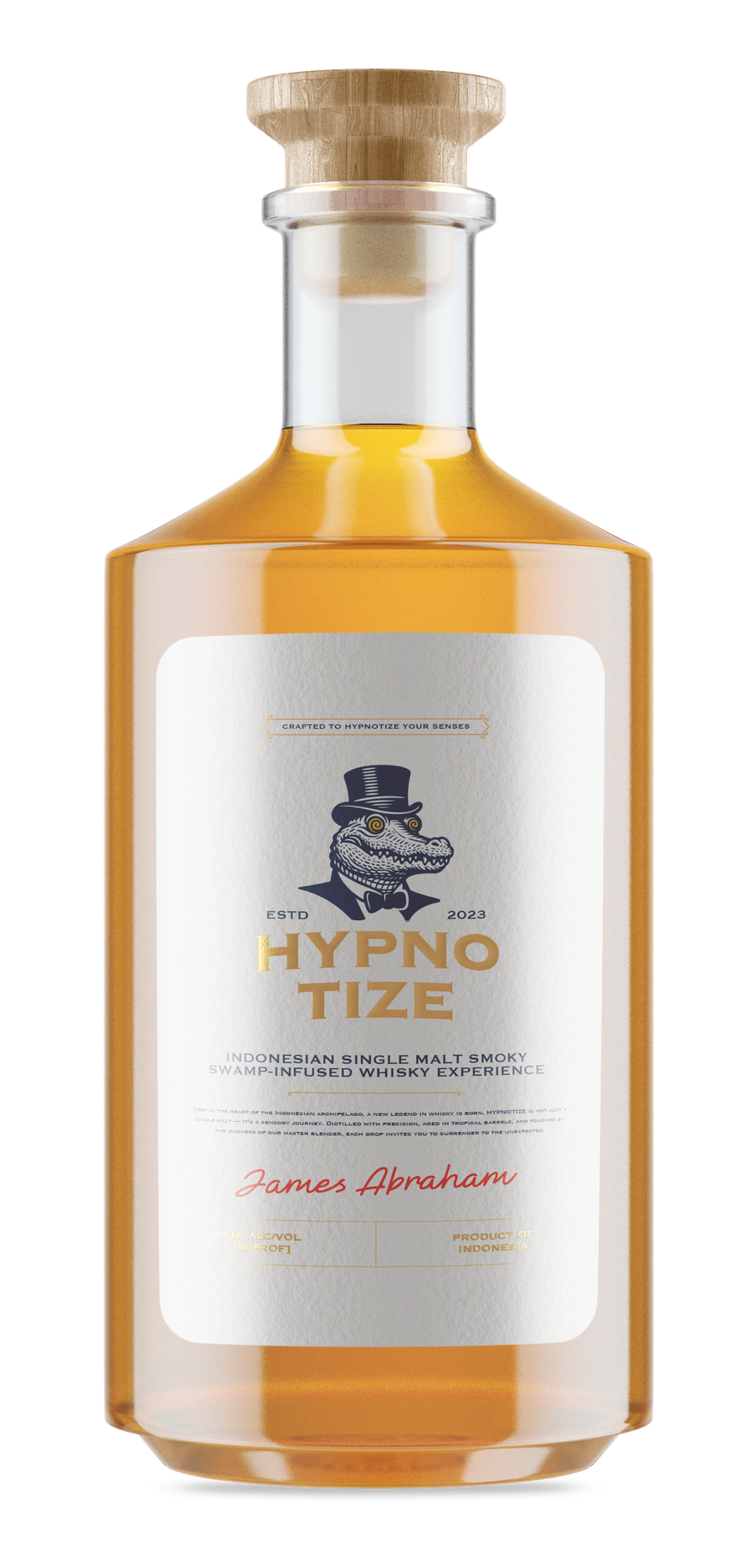
Deep, engraved, nocturnal. Every crest and every wordmark starts here.
#284263The wordmark color. Warm enough for foil, bright enough to catch bar light.
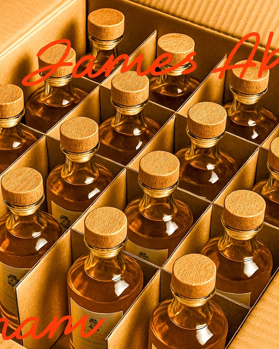
#FFC639Every shot lives somewhere between a product page and a still life — pour, wood, brass, and a crest that still reads slightly out of focus. If it doesn't survive a photo, it doesn't survive the brief.

Next Case Study