Jakarta, Indonesia
fajarpursigit.works@gmail.com
+62 8594 1177 129
thingsfajar.com
Making brands clearer
and harder to forget.
I’m Fajar, a digital designer and art director with six years of experience across tech, property, food, and retail. I turn brand ideas into identities, campaigns, and digital experiences people can recognize and use.








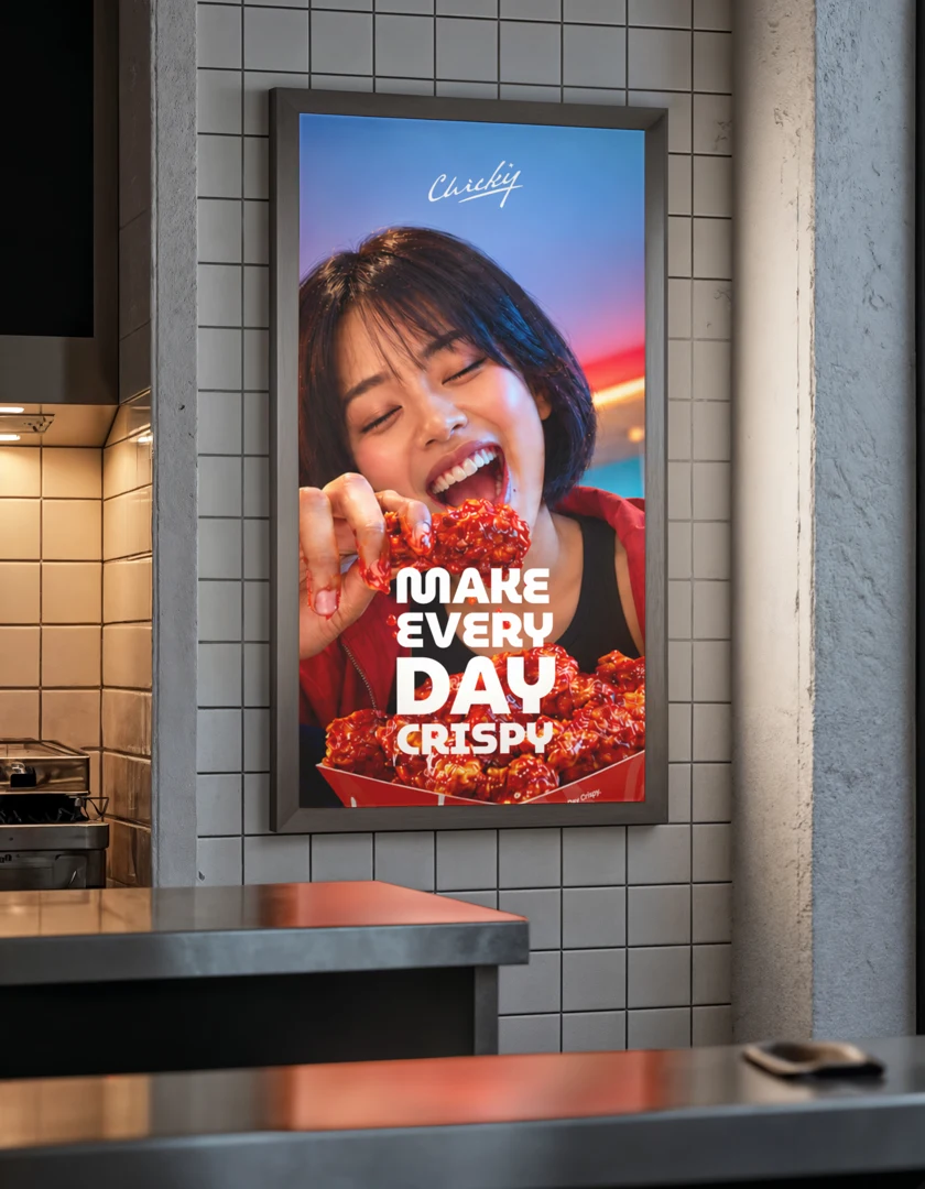
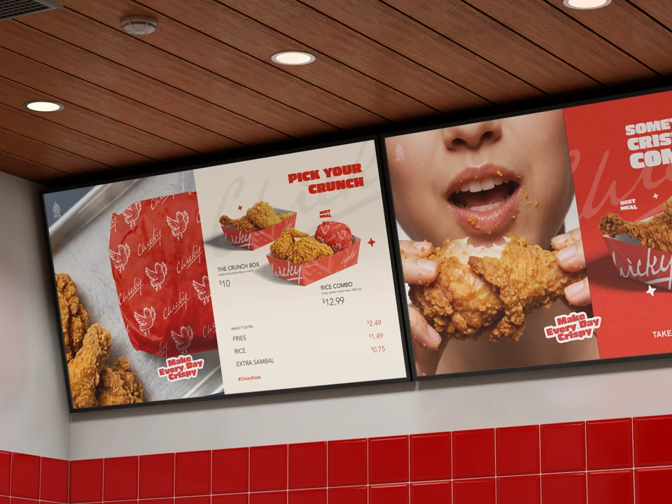
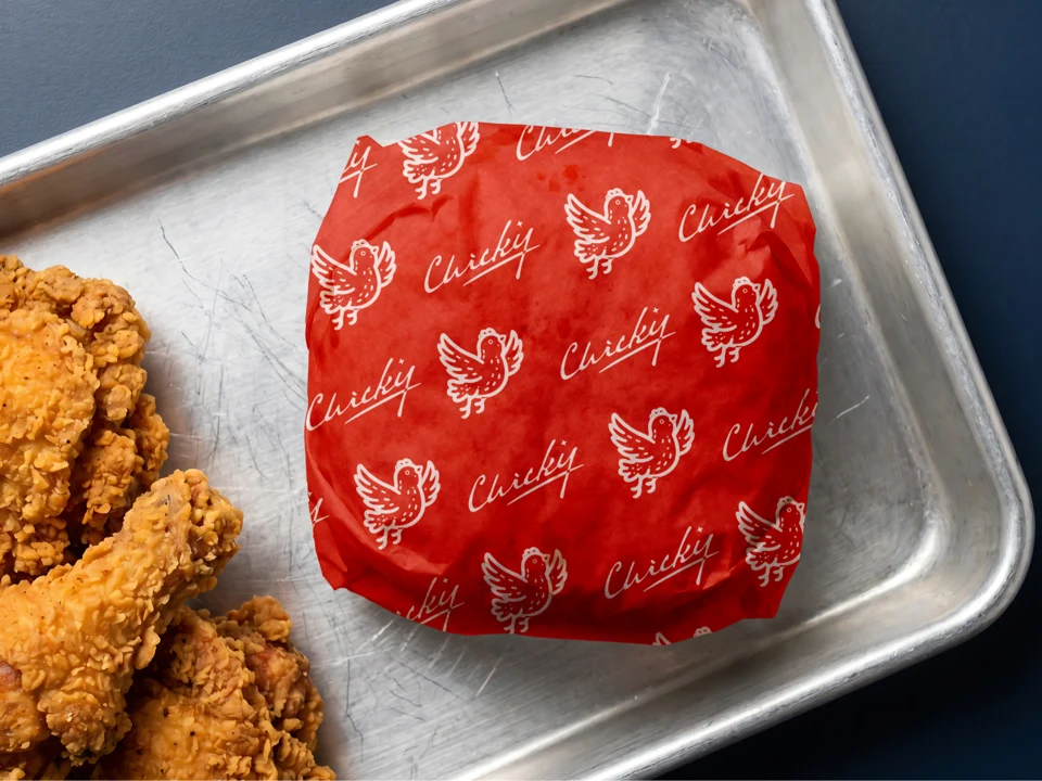
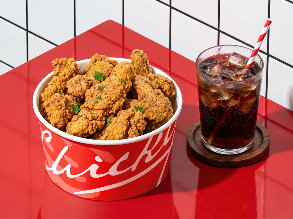
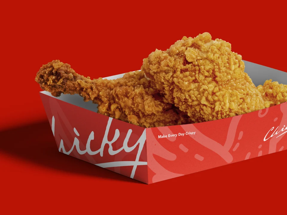
Make Every Day Crispy.
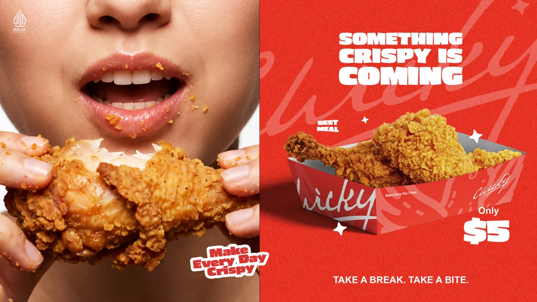
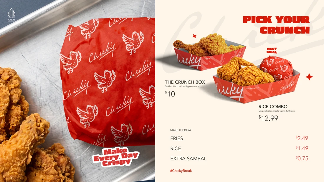
Chicky brings a little more crunch to the everyday lunch break.
An expressive chicken mark, bold colors, and a repeat pattern carry that energy from the takeaway box to the campaign film.
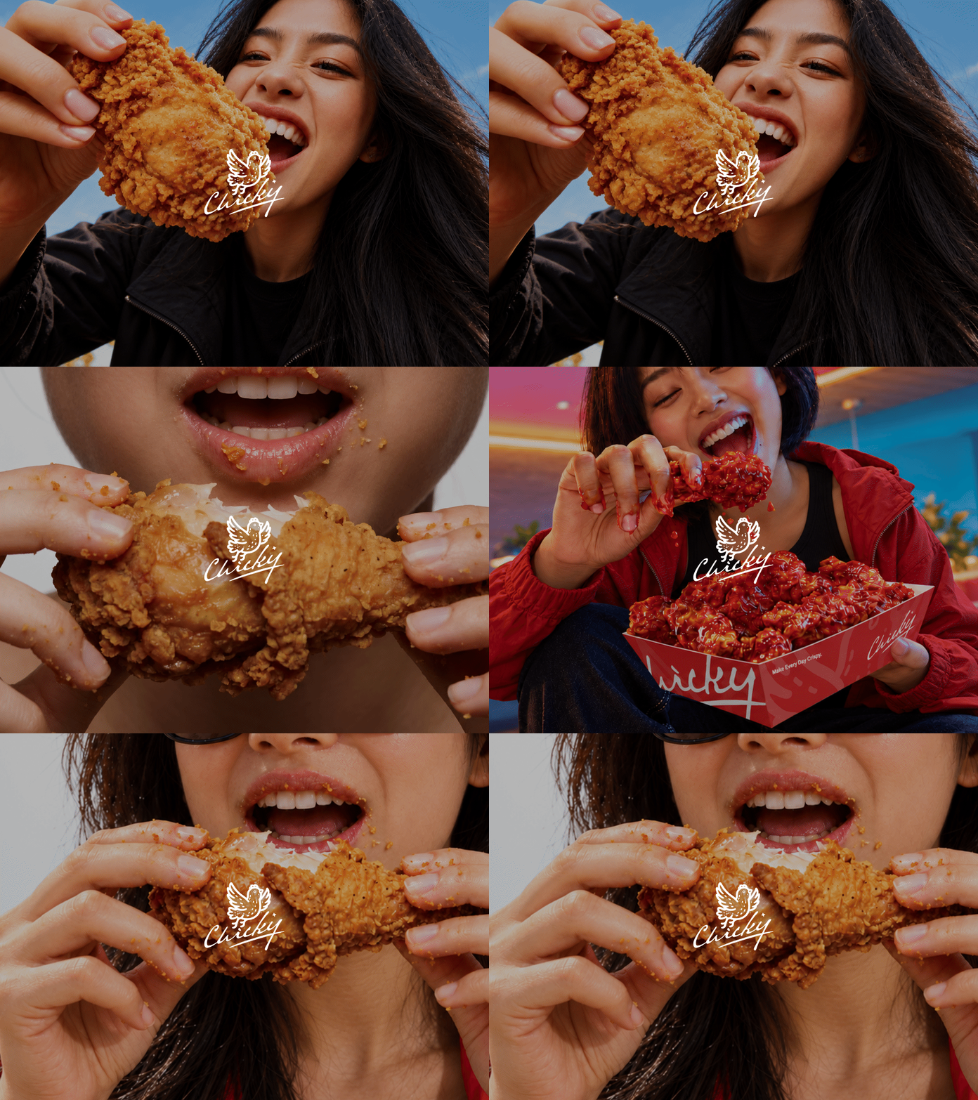

Bite. Recharge.
Repeat.
Chicky Break turns a familiar moment in the workday into a reason to pause and grab a bite. The film builds around the rhythm of “Bite. Recharge. Repeat.”, using bold brand colors, close-up food shots, and playful motion to make that everyday break feel like Chicky.


A Feed That Makes Product Benefits Clear
Varesse makes haircare built around ingredients and results. Its Instagram content needed to explain those benefits while giving the brand a consistent, recognizable presence.
I paired product photography with clear editorial hooks: how to use it, what it does, and why it matters. The feed and story layouts bring product education, promotions, and everyday haircare advice into one system.
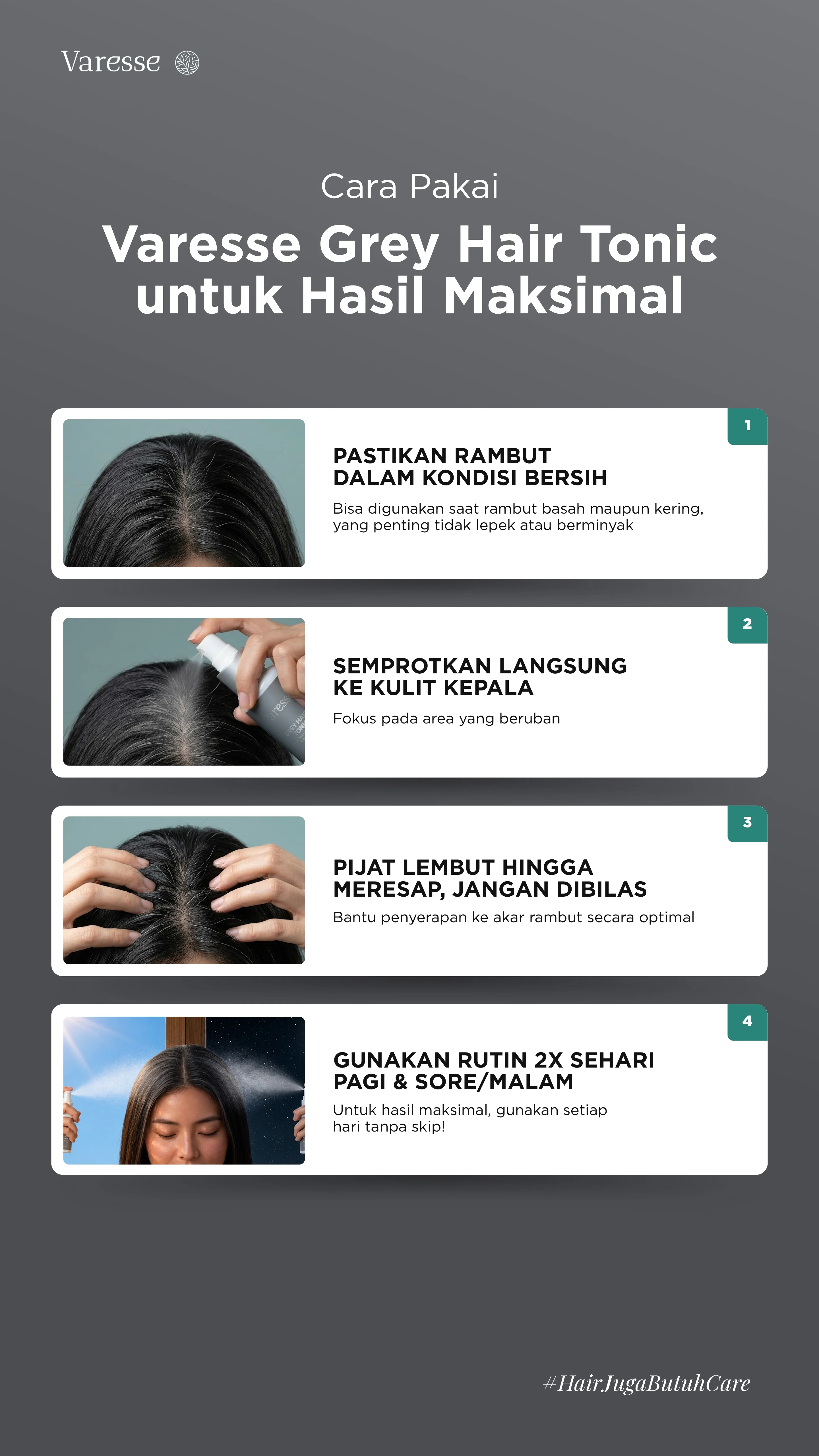 Story / Cara Pakai
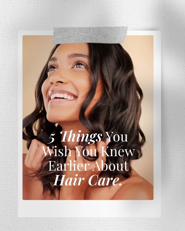 Editorial Hook
 Award-Winning
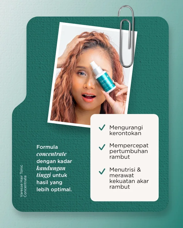 Product Story
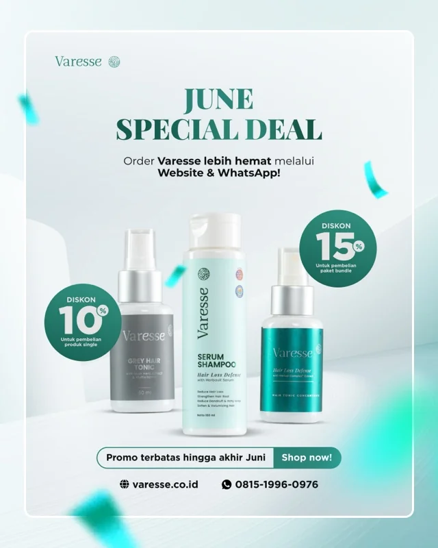 Promo Graphic
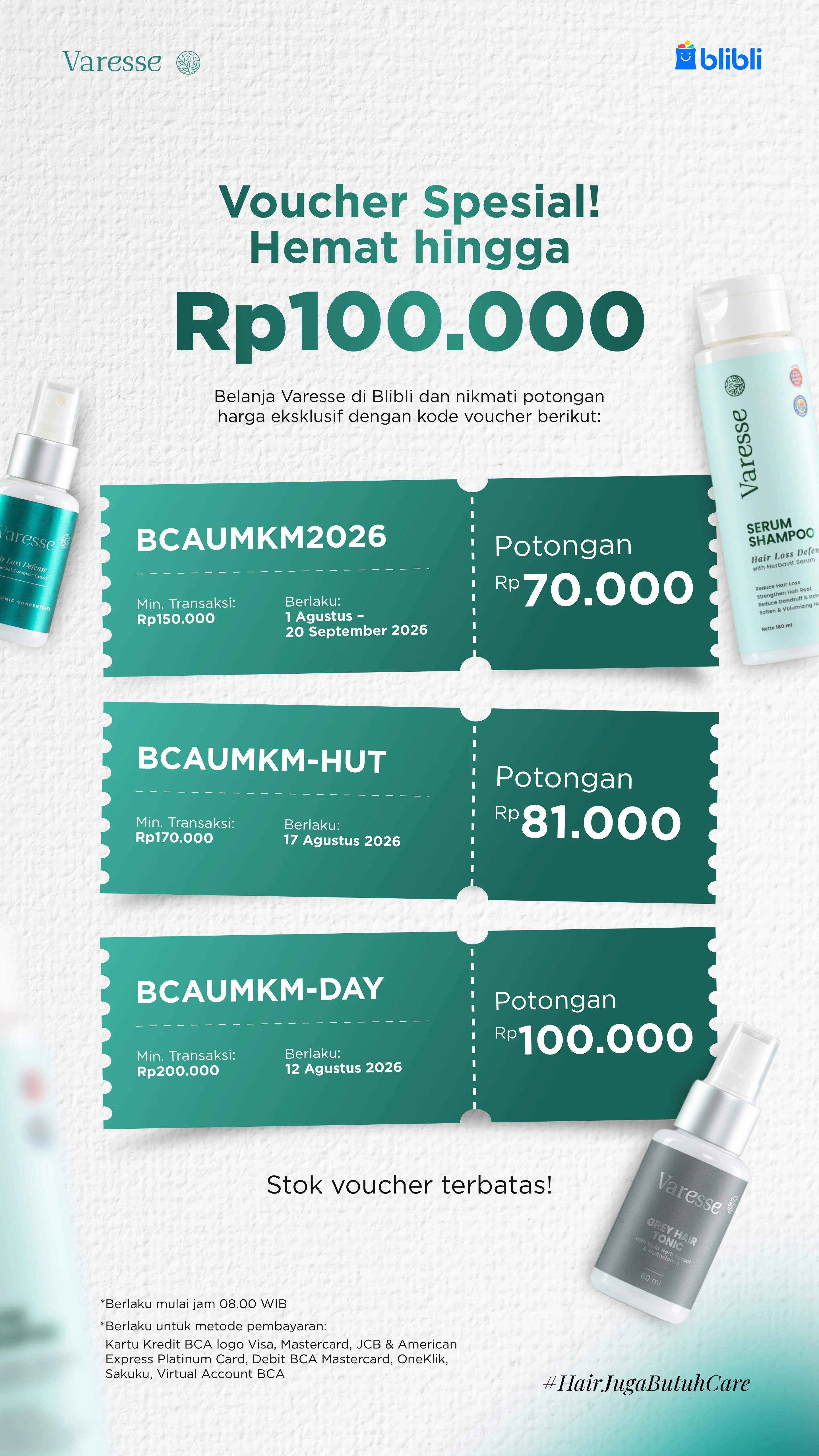 Story / Voucher Promo
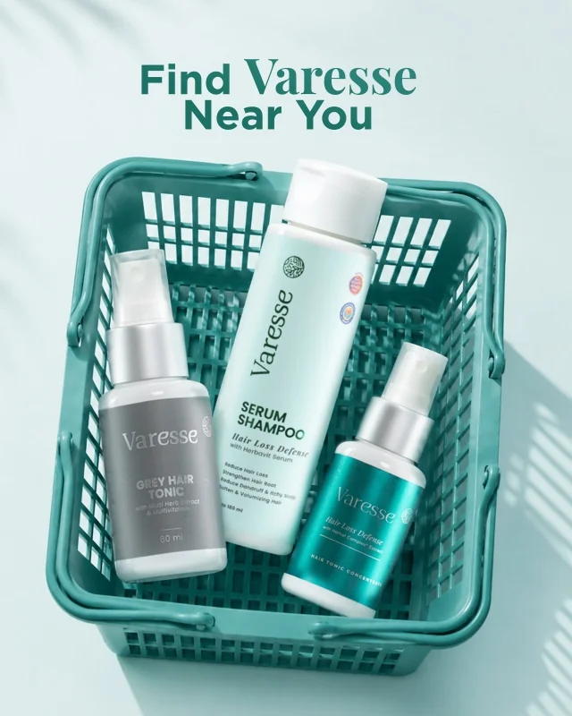
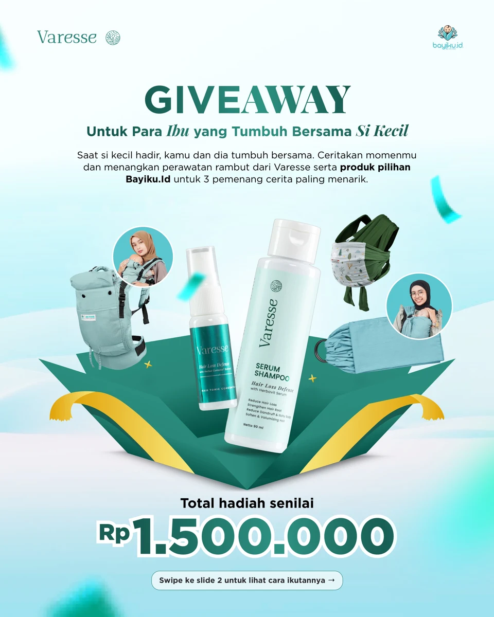 Retail & Giveaways
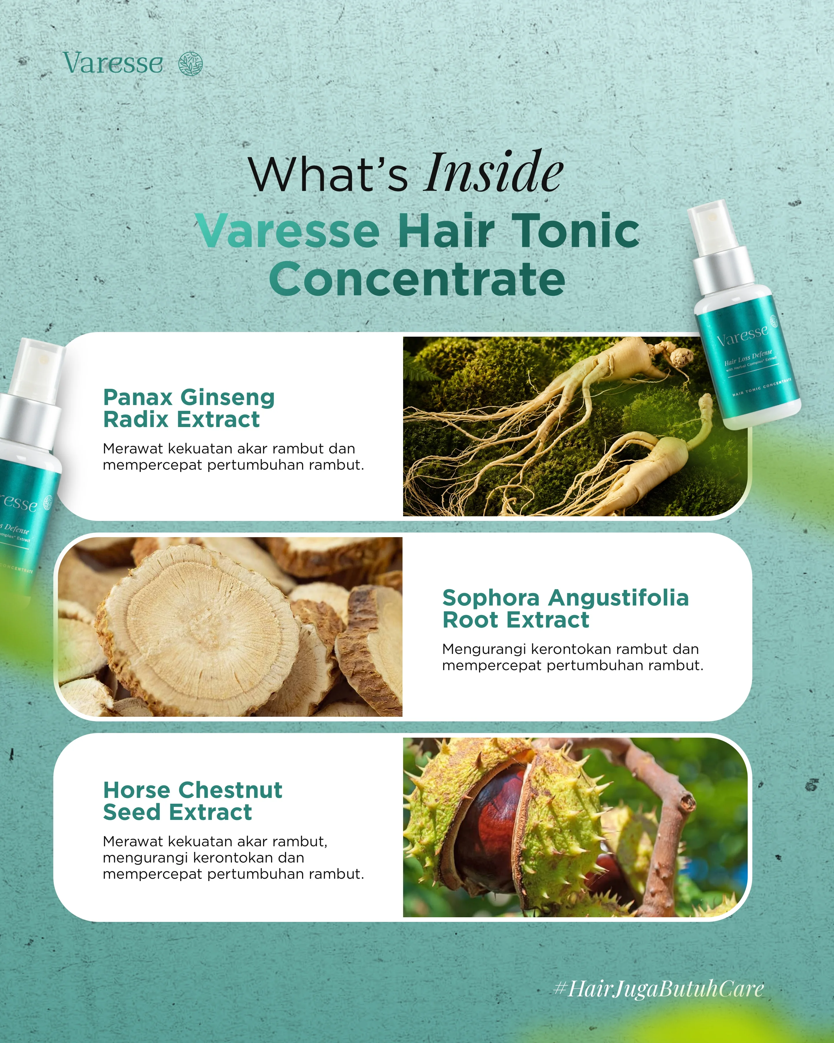
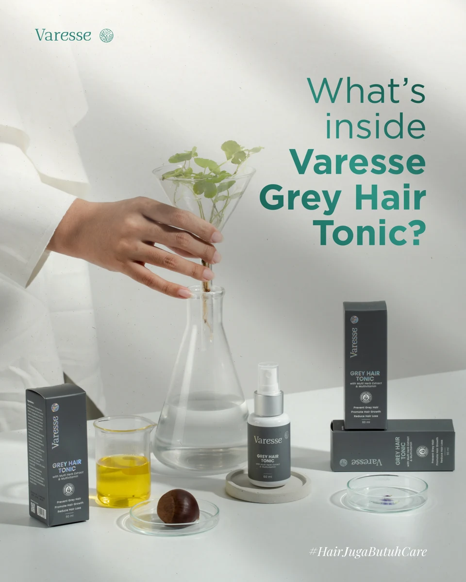 Ingredients
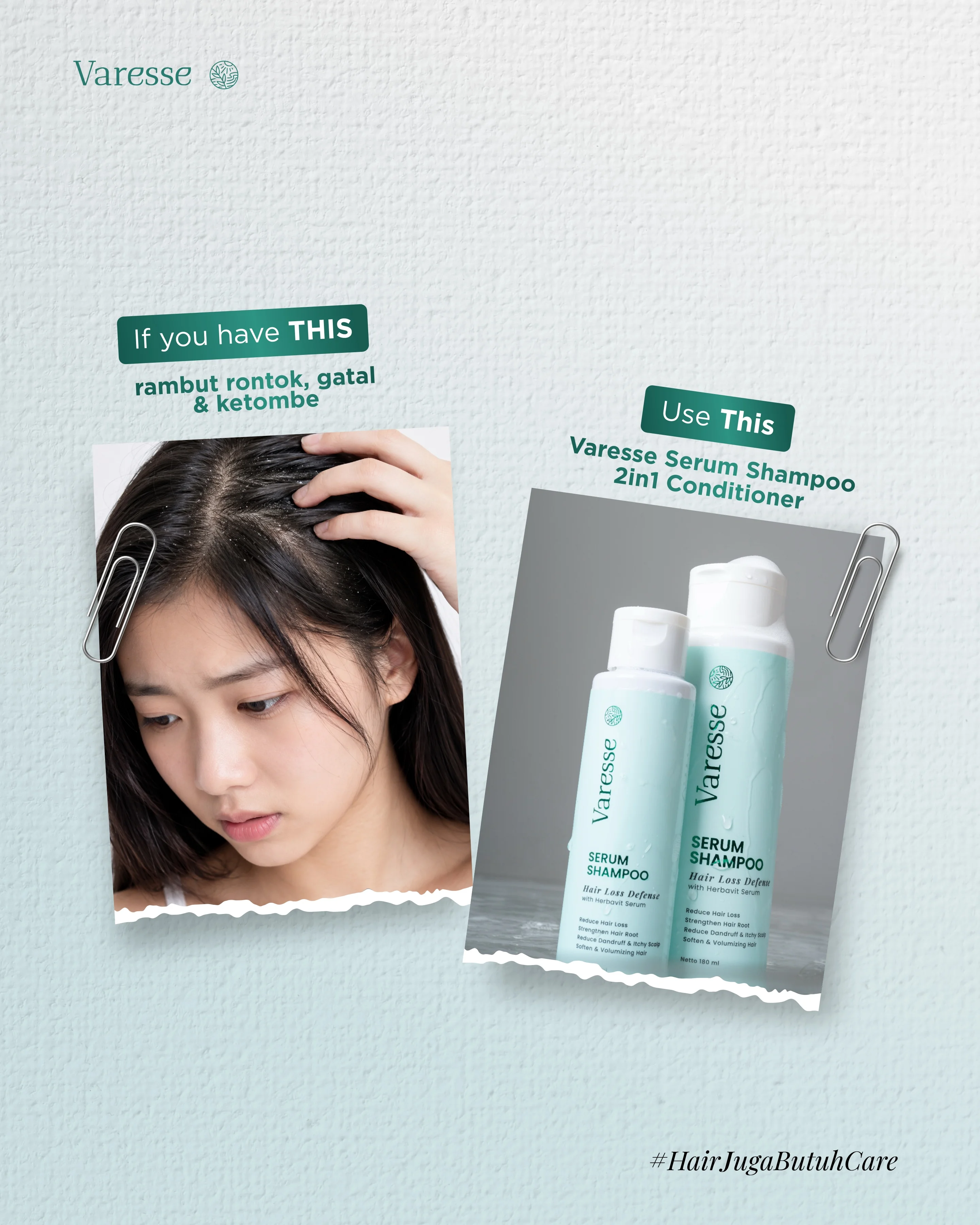
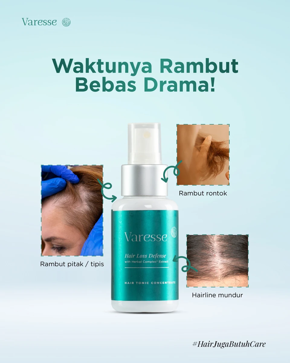 Problem / Solution
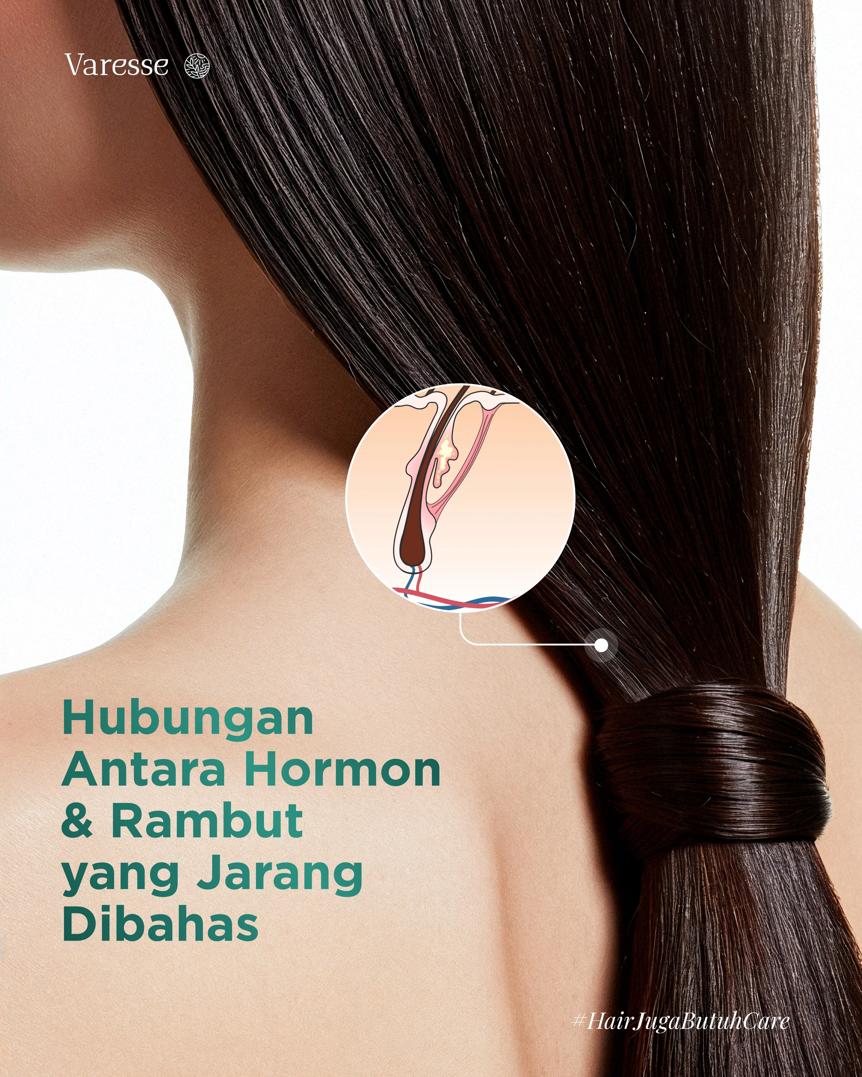
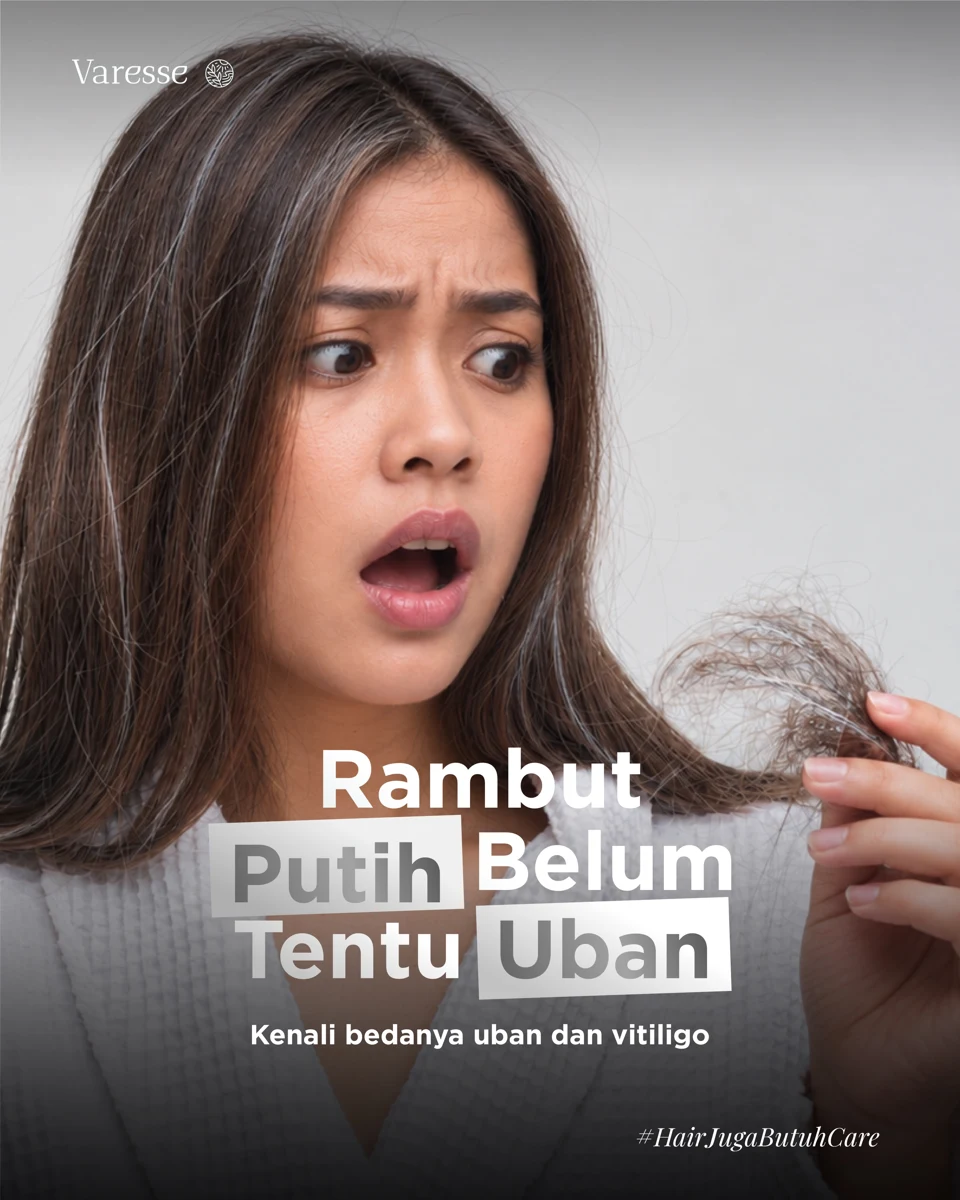
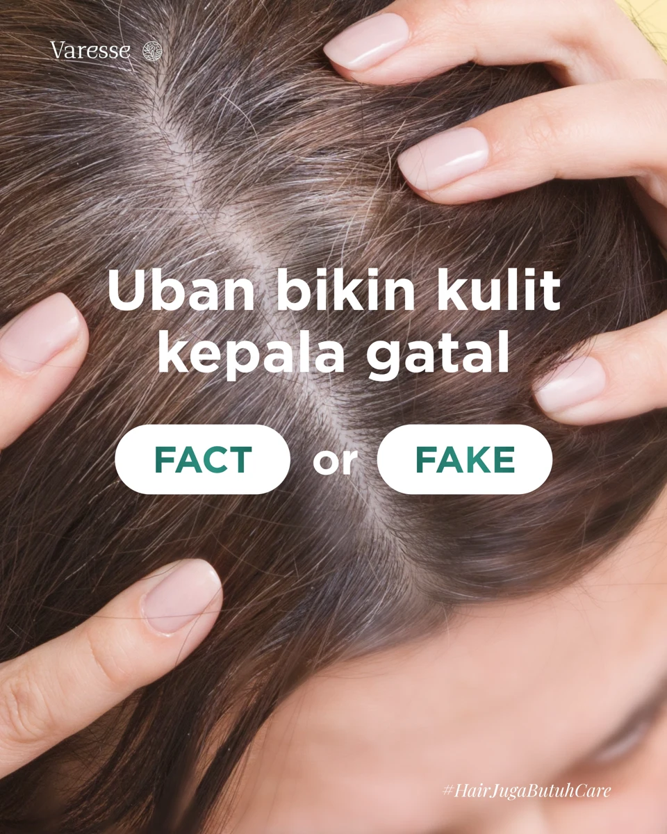 Hair Education
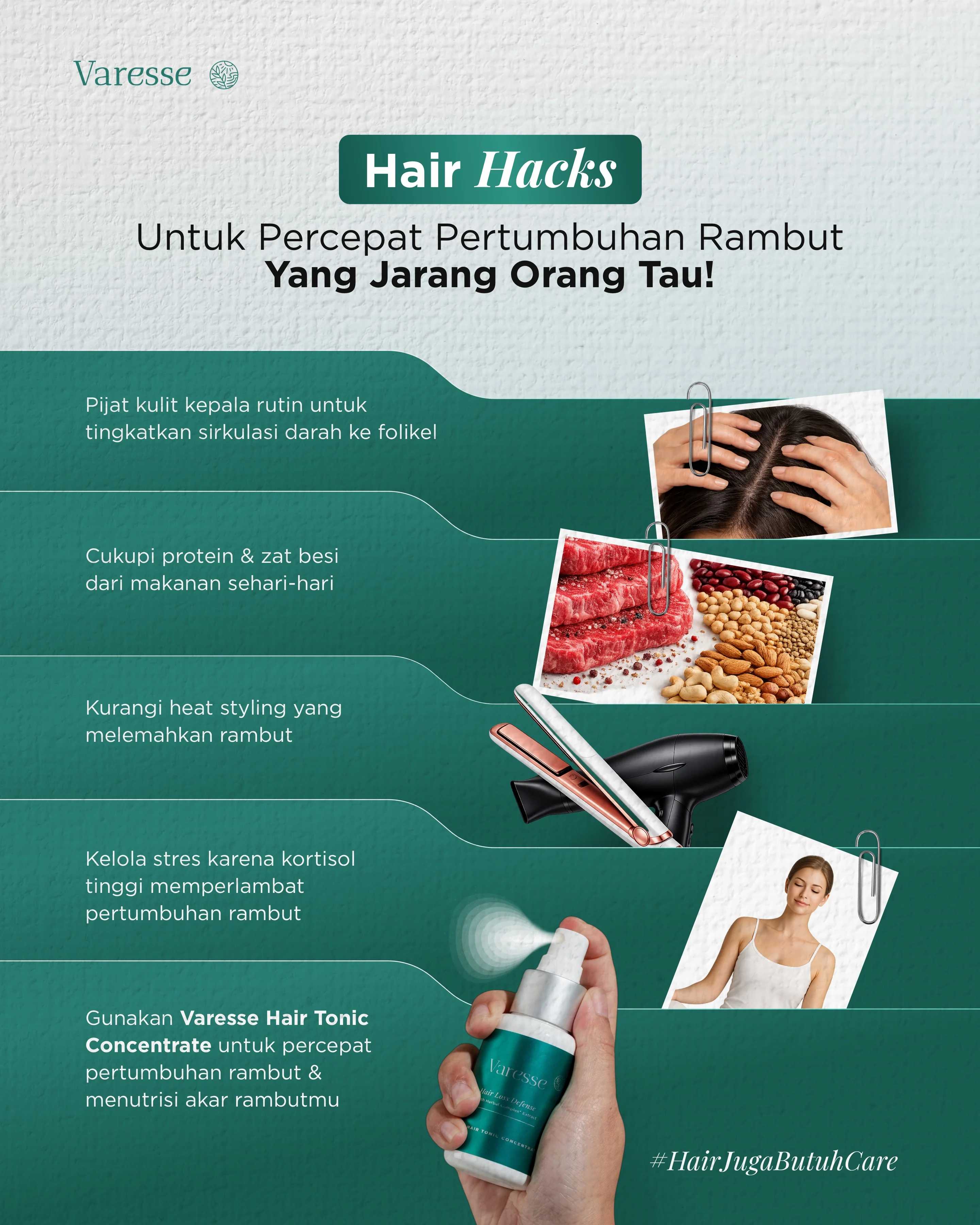
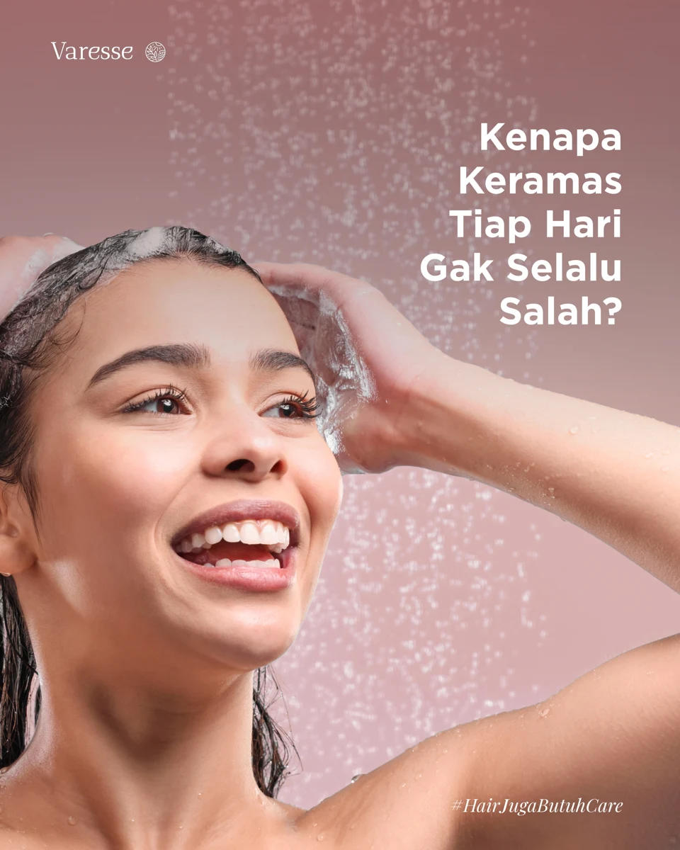
 Tips & Myths
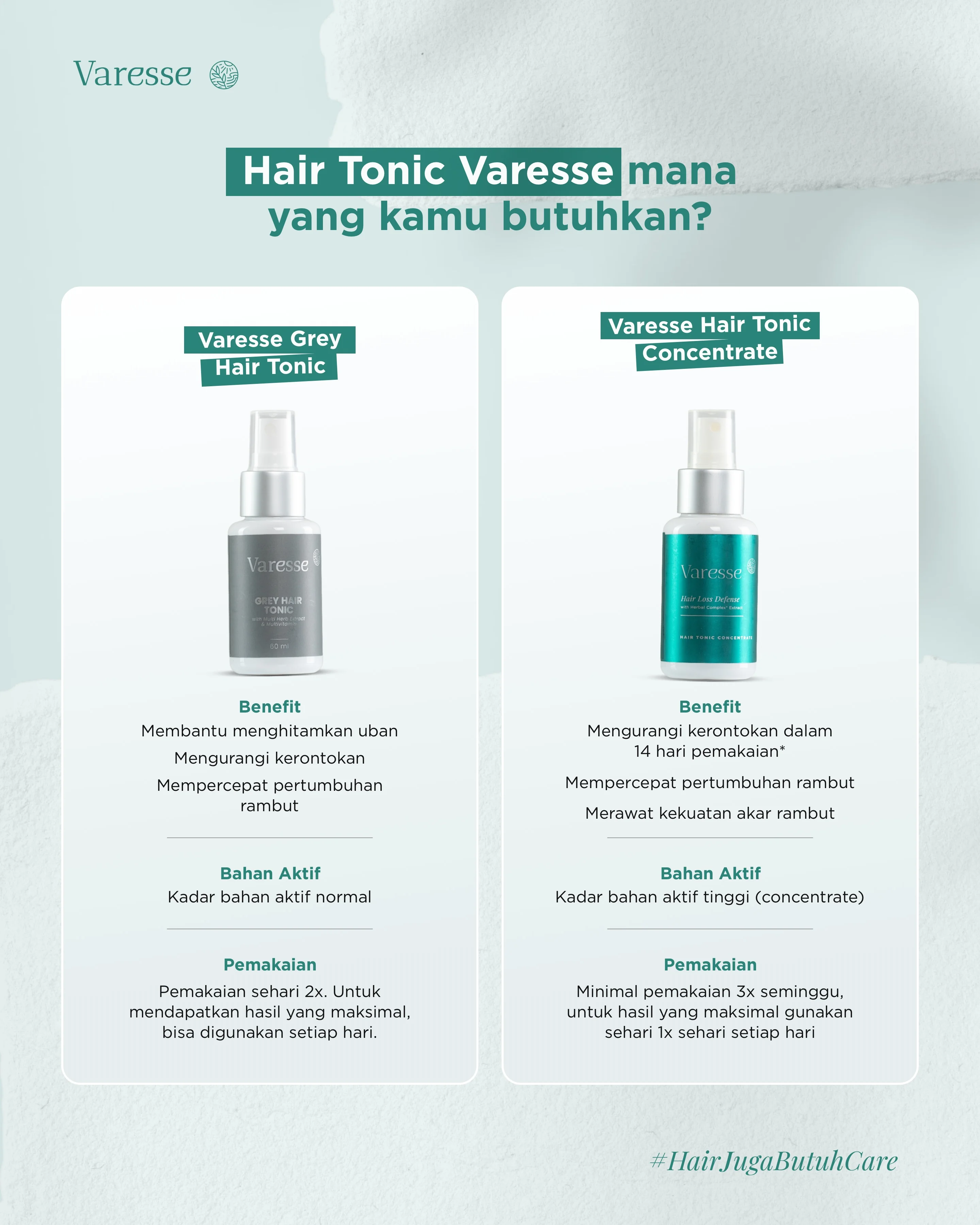
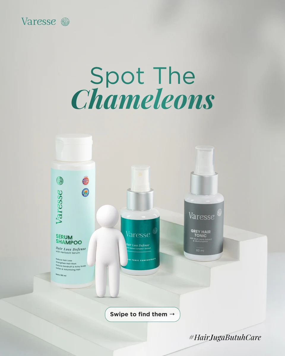 Product Lineup
 Brand Identity / Logo Mockup
 Office Signage
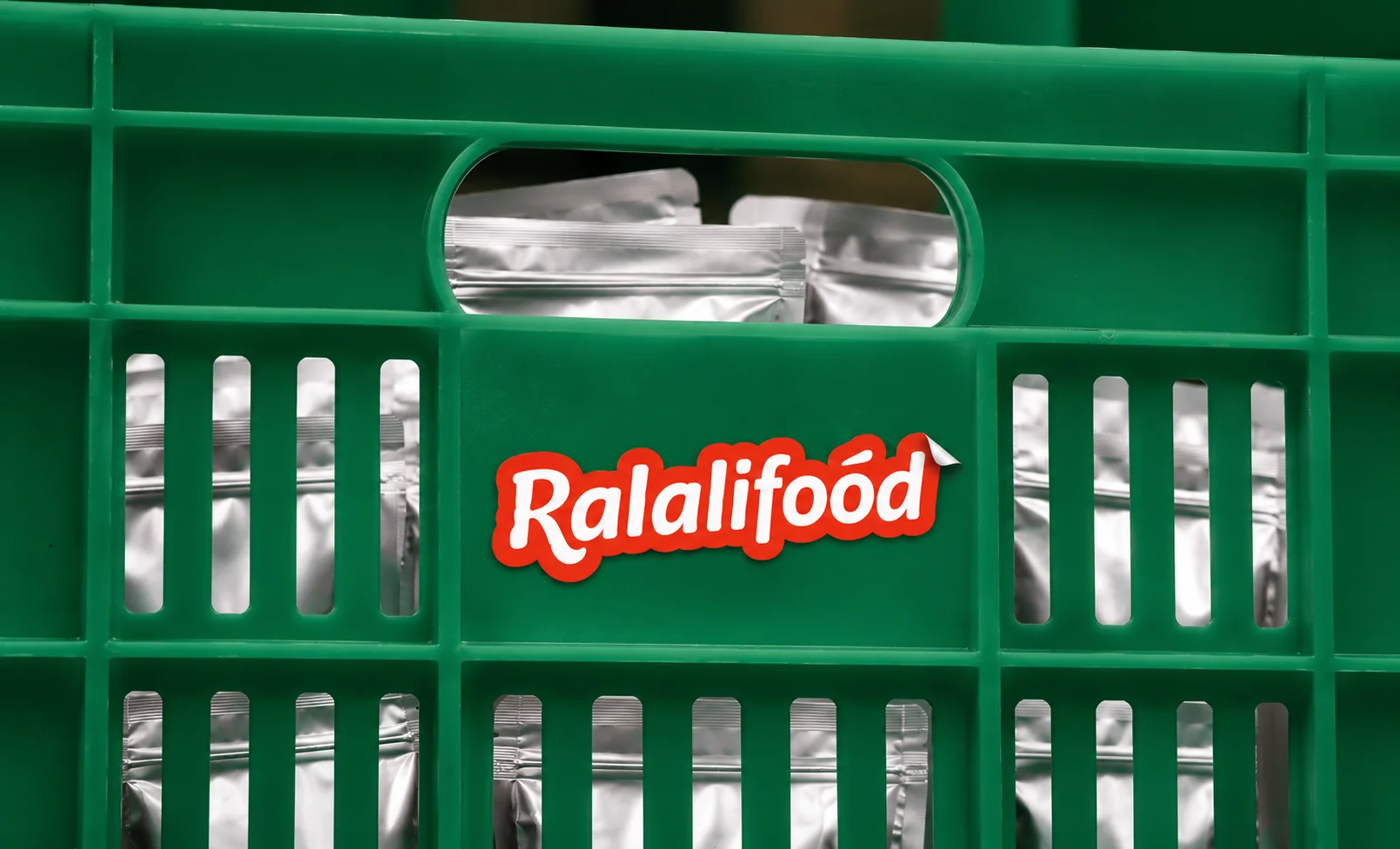 Product Pouch
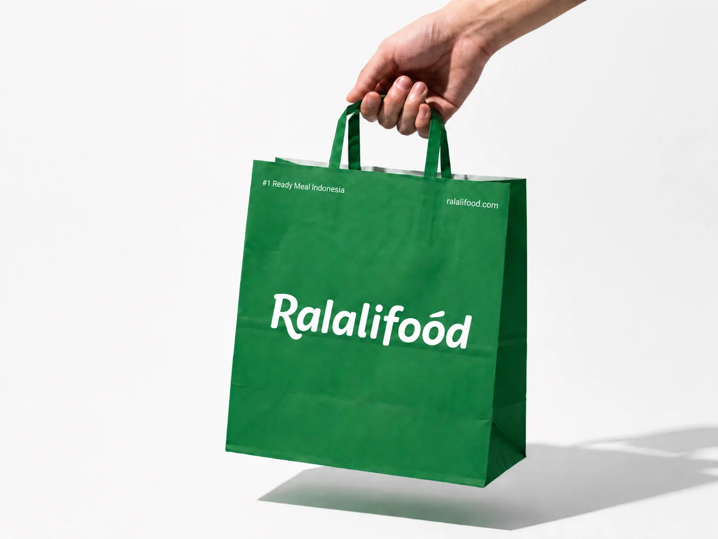 Retail Bag
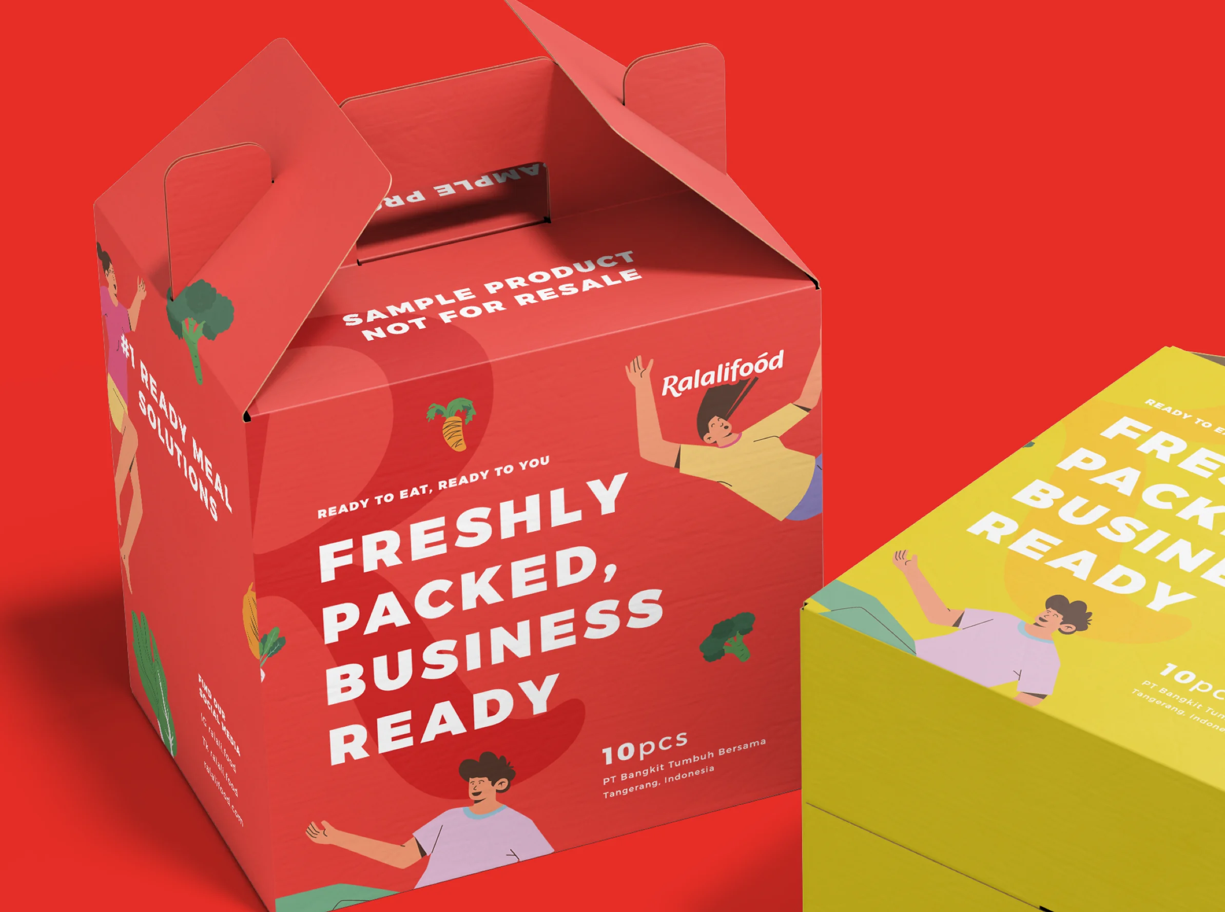 Delivery Box
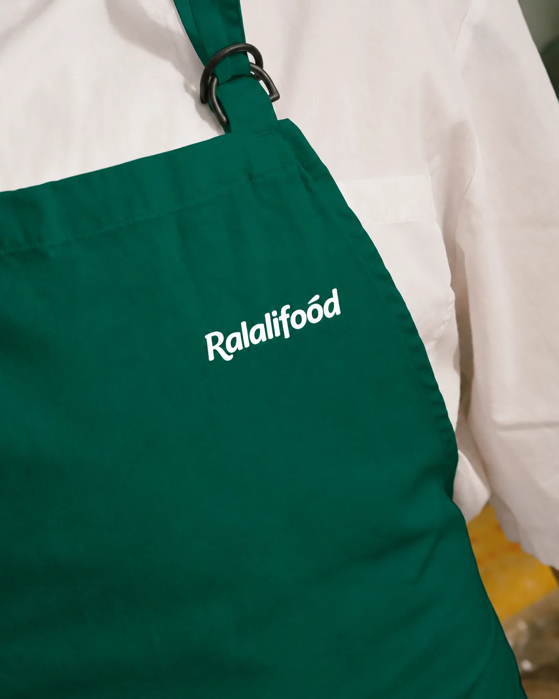 Uniform
 Product UI & Logo Motion

 Brand Photography

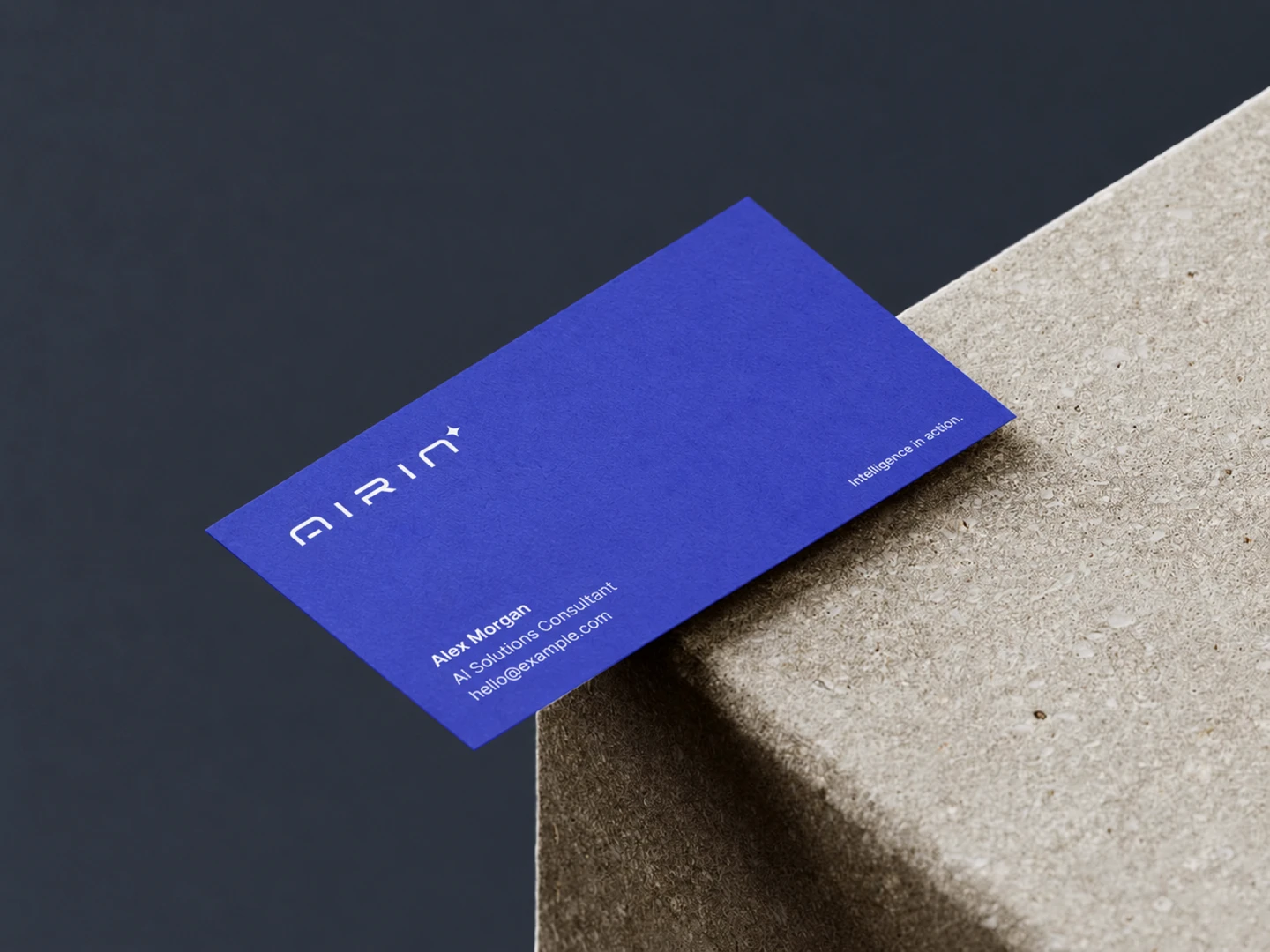 Business Card
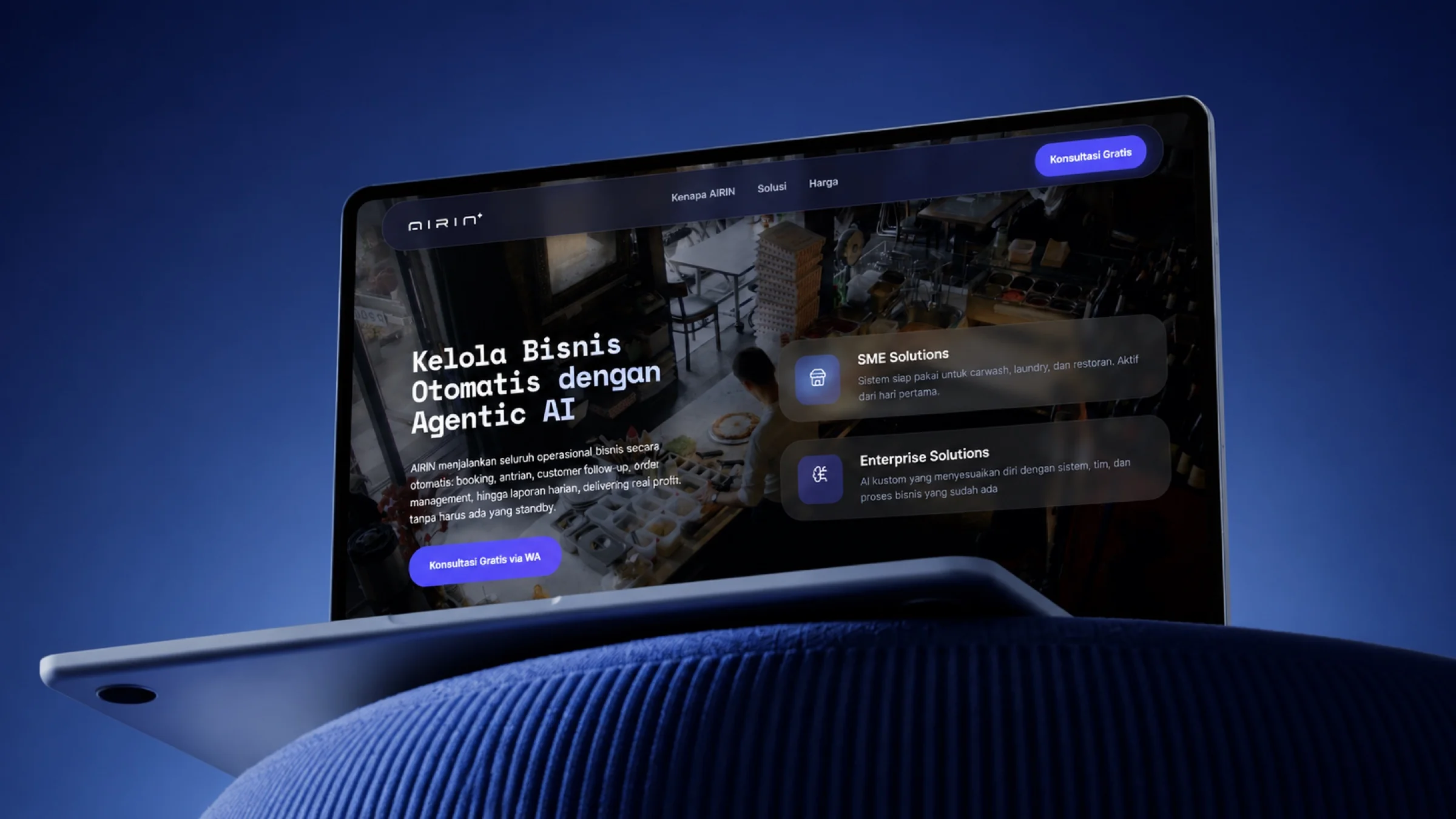
 Device Mockup
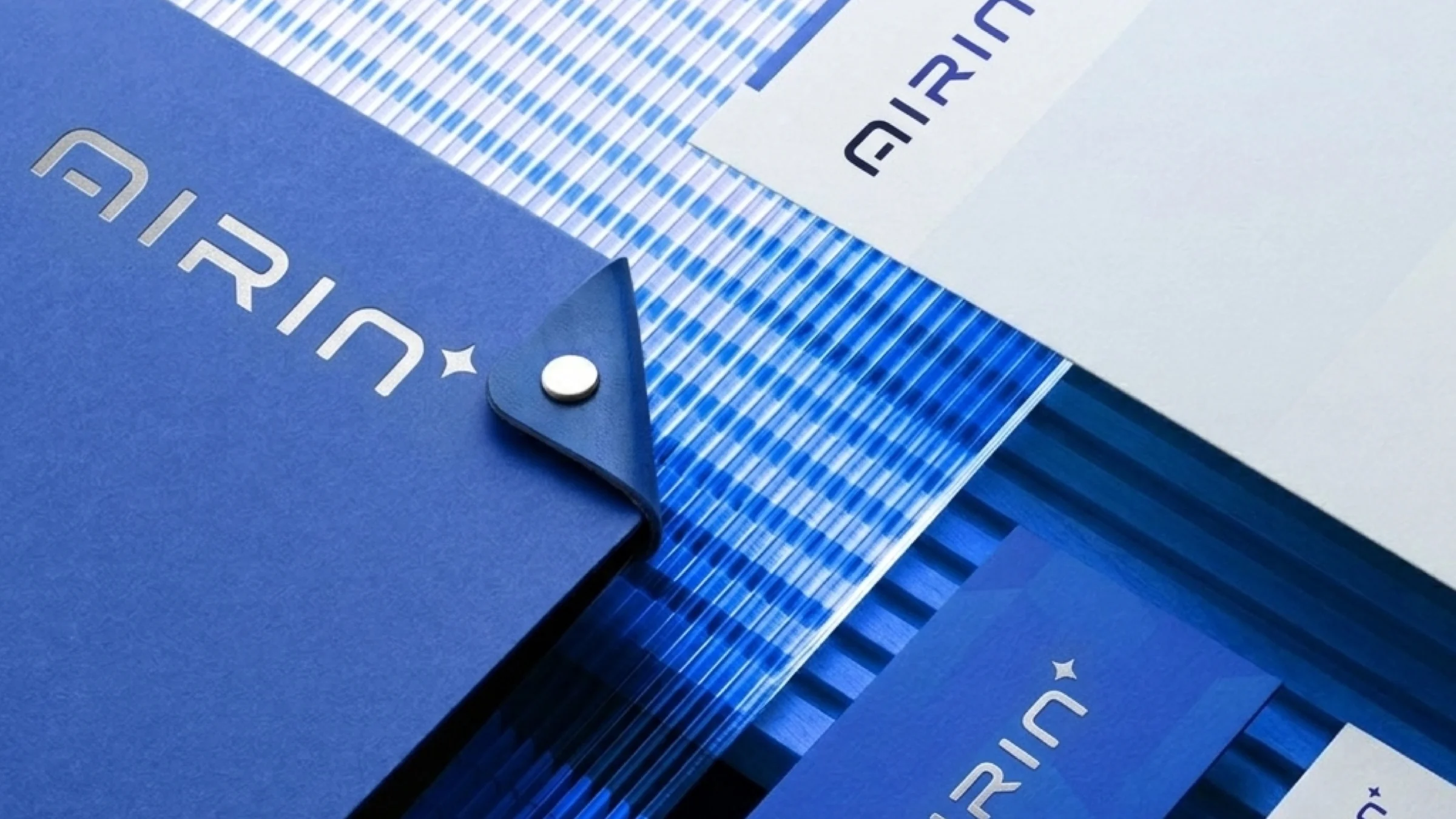 Product UI
Ready to Serve. Easy to Understand.
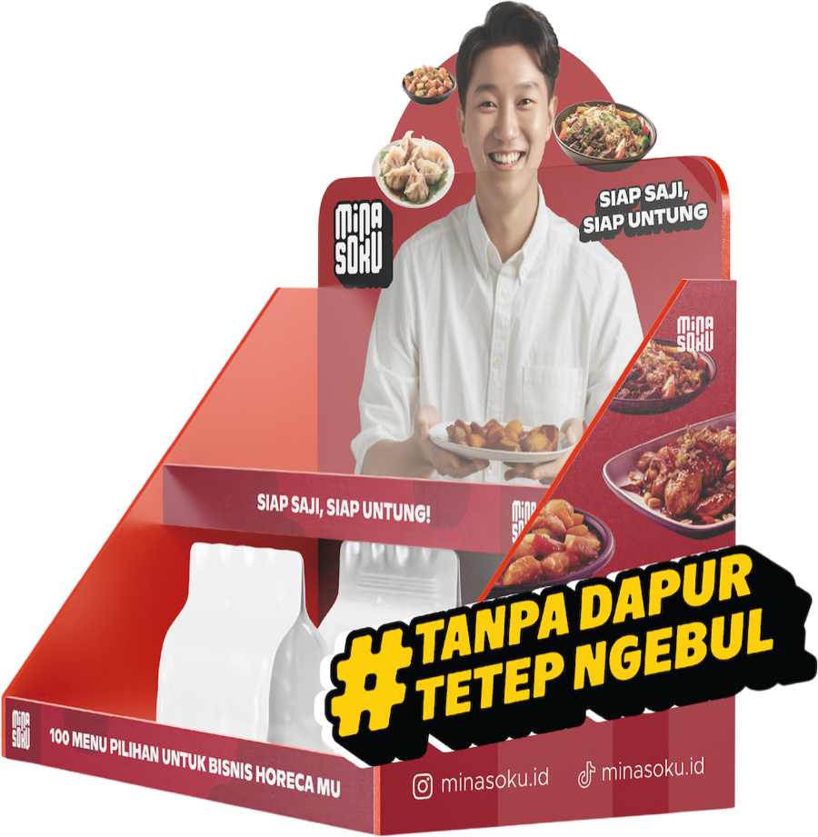
Minasoku offers ready-to-serve food for busy commercial kitchens. Its campaign visuals needed to show both the appeal of the food and the practical reasons to stock it.
Product imagery leads the layout, supported by concise messages about preparation, storage, and use. The same approach carries across digital campaigns and sales materials for business buyers.
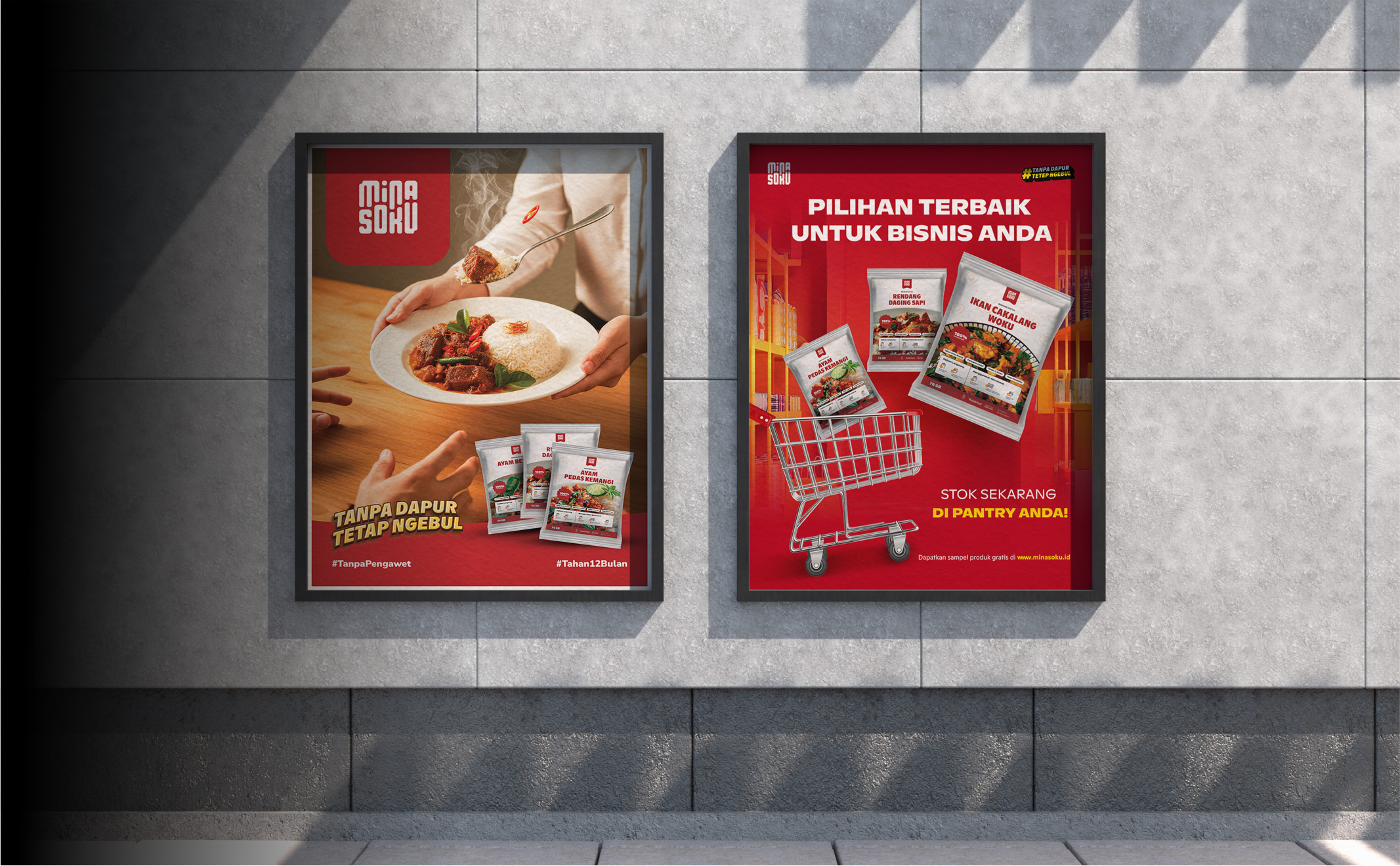 Key Visual Wall / In-Store Display Mockup
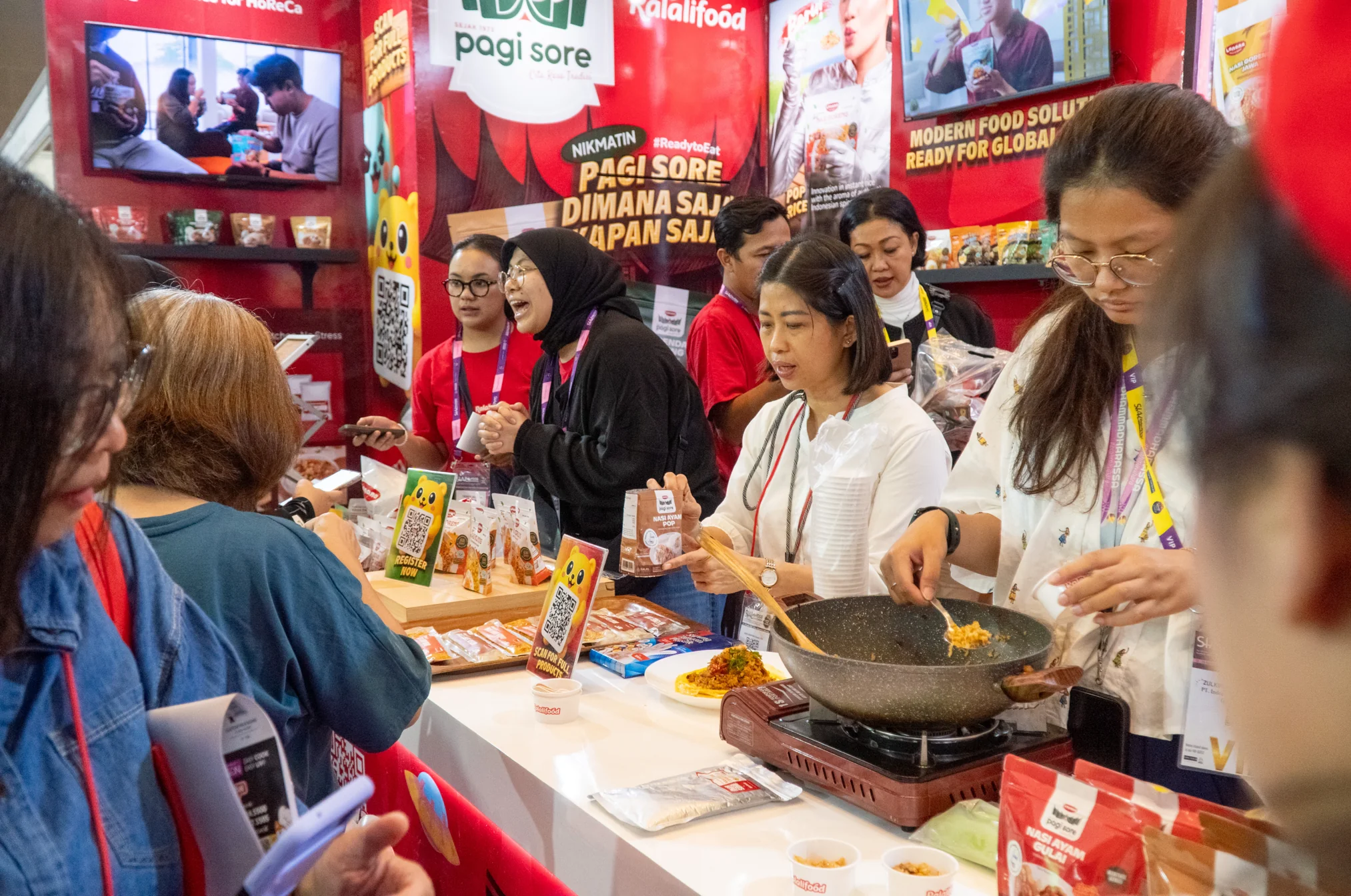
A Booth Built Around the Brand
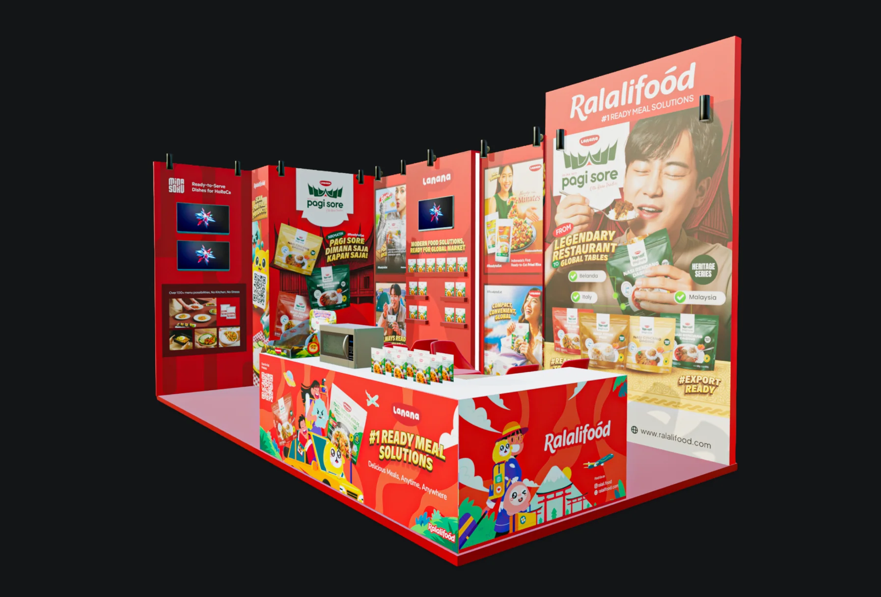
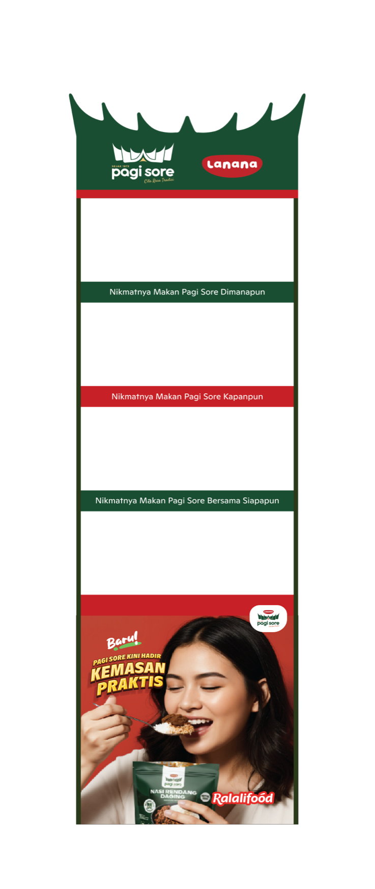
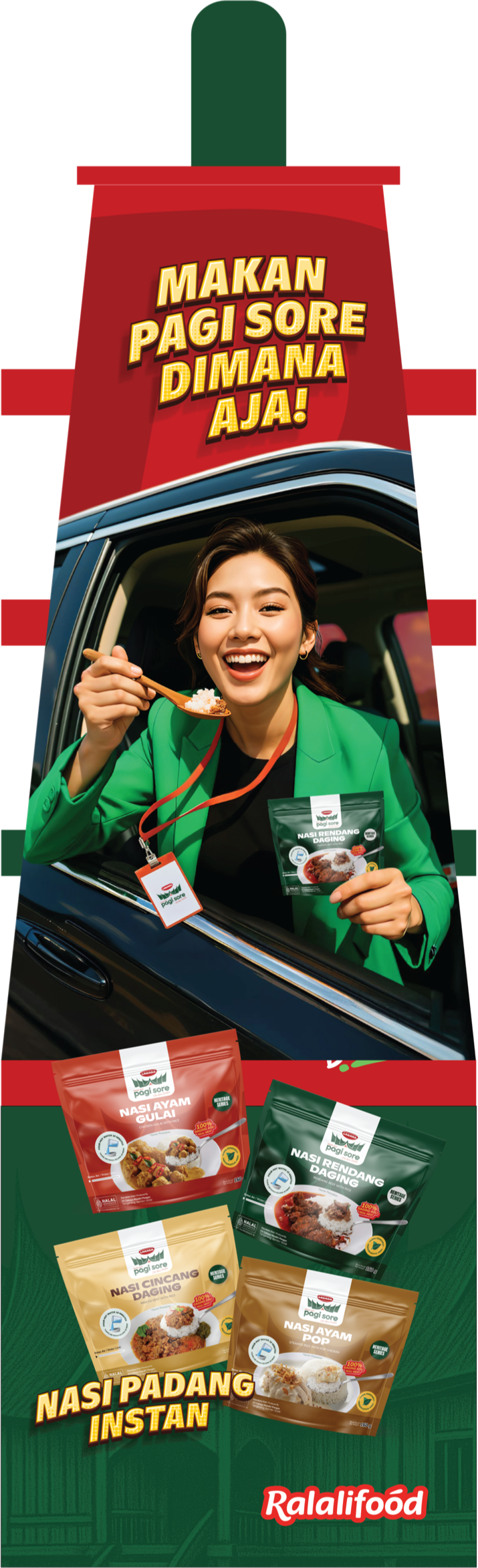
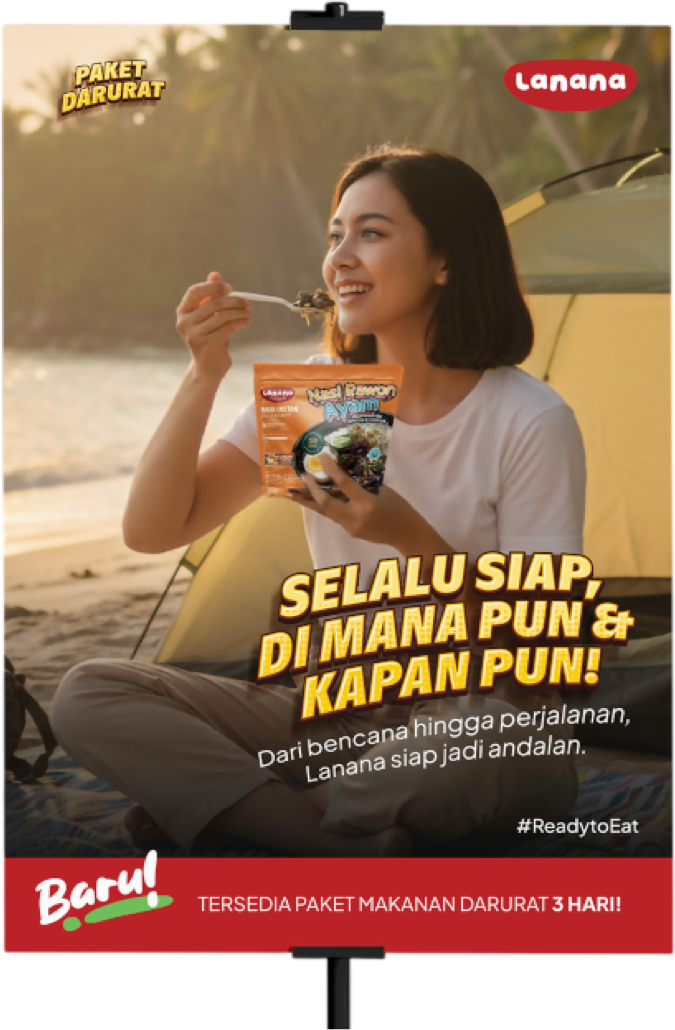
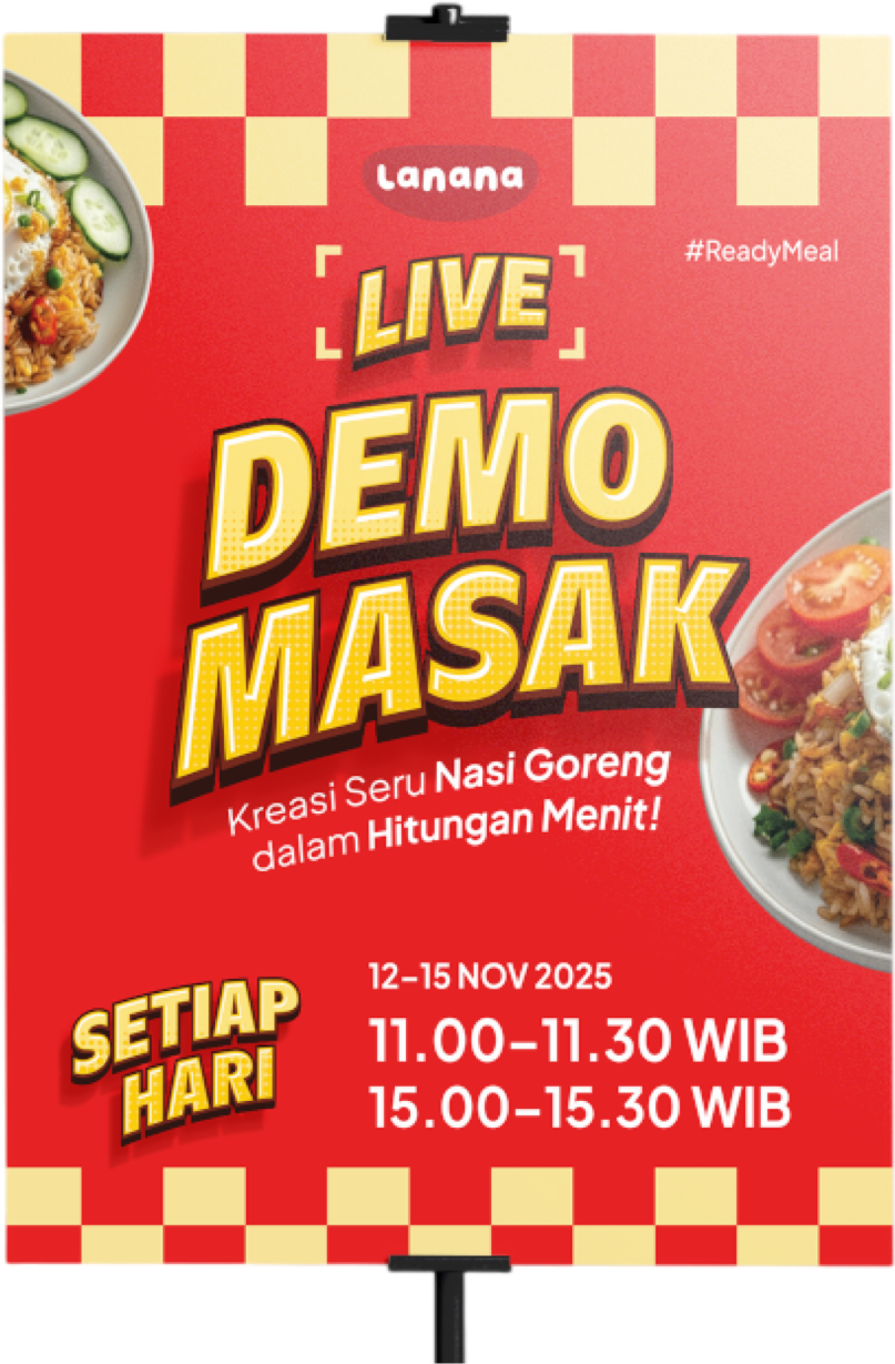
I led the creative direction for Ralalifood’s presence at SIAL Interfood 2025, bringing the booth, product launches, and partner collaborations into one event experience.
The work connected spatial design, signage, packaging, and sales materials. Each piece helped visitors discover the products and gave the team a clear setting for business conversations.
Impact
Brand visibility through the Pagi Sore collaboration
IDR 60M+ in event revenue from limited-stock Pagi Sore sales
200+ qualified B2B leads across local and export distribution
An opportunity to explore quick-commerce distribution with ASTRO
From Event Launch to Retail Shelf
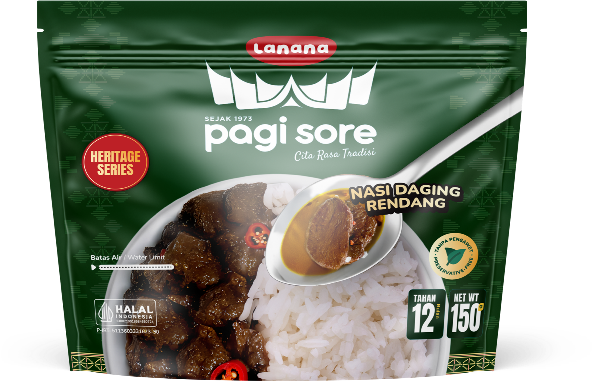
Lanana x Pagi Sore’s packaging was first developed for an event. The next step was to adapt it for retail, where the product needed to explain itself without a sales team beside it.
The refresh establishes a consistent hierarchy for brand, product name, and supporting information. A shared layout gives the range a clearer presence on shelf and a repeatable format for future variants.
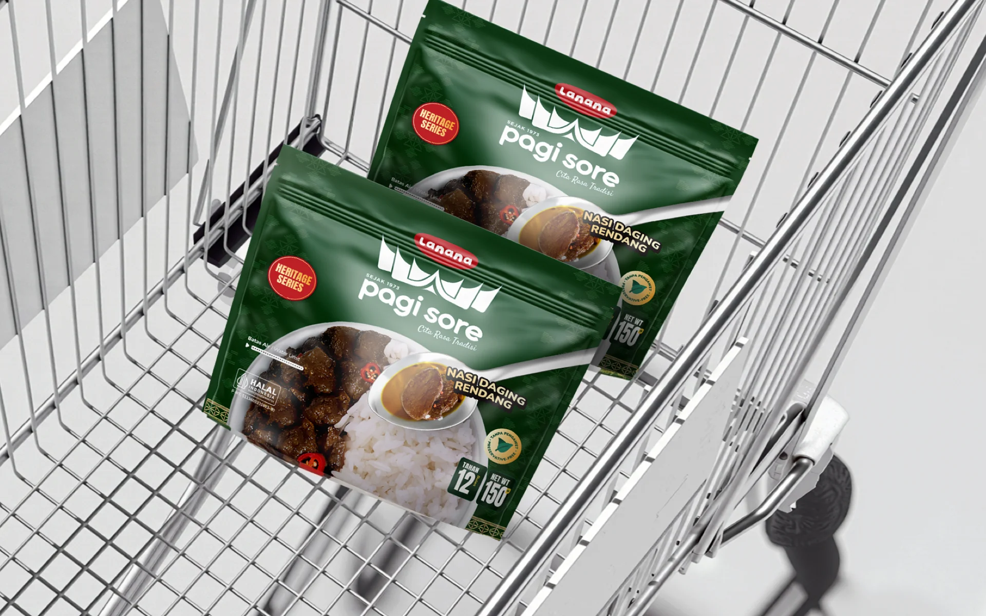 Packaging Application / Retail Mockup
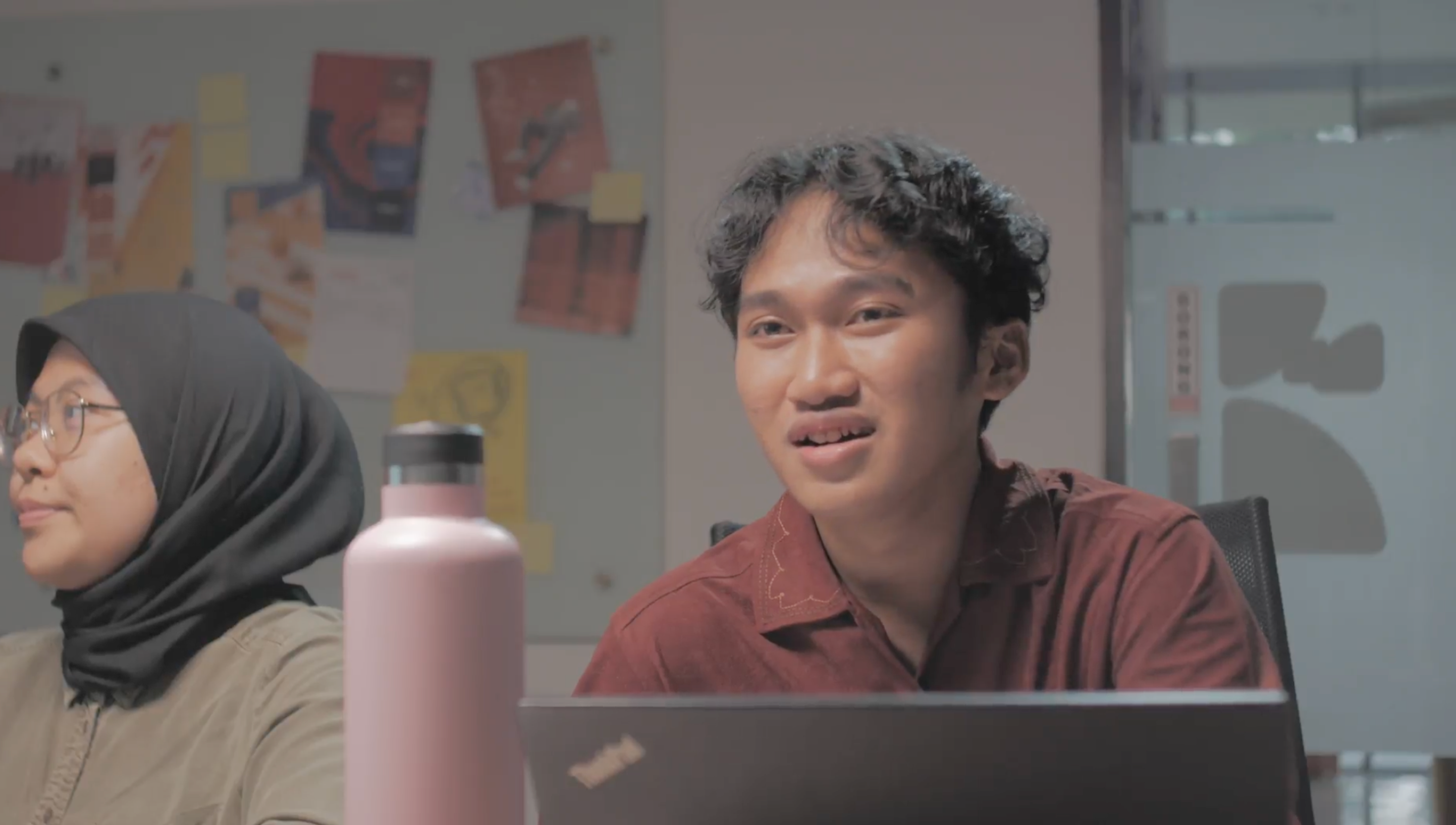
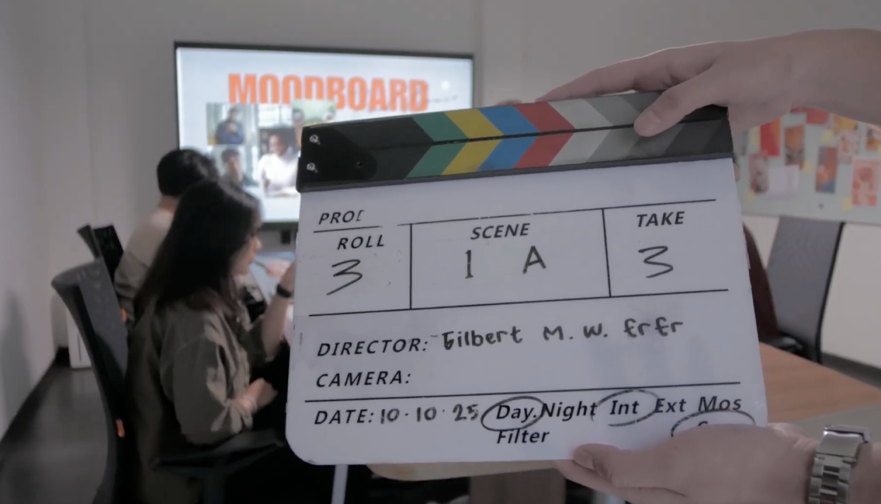
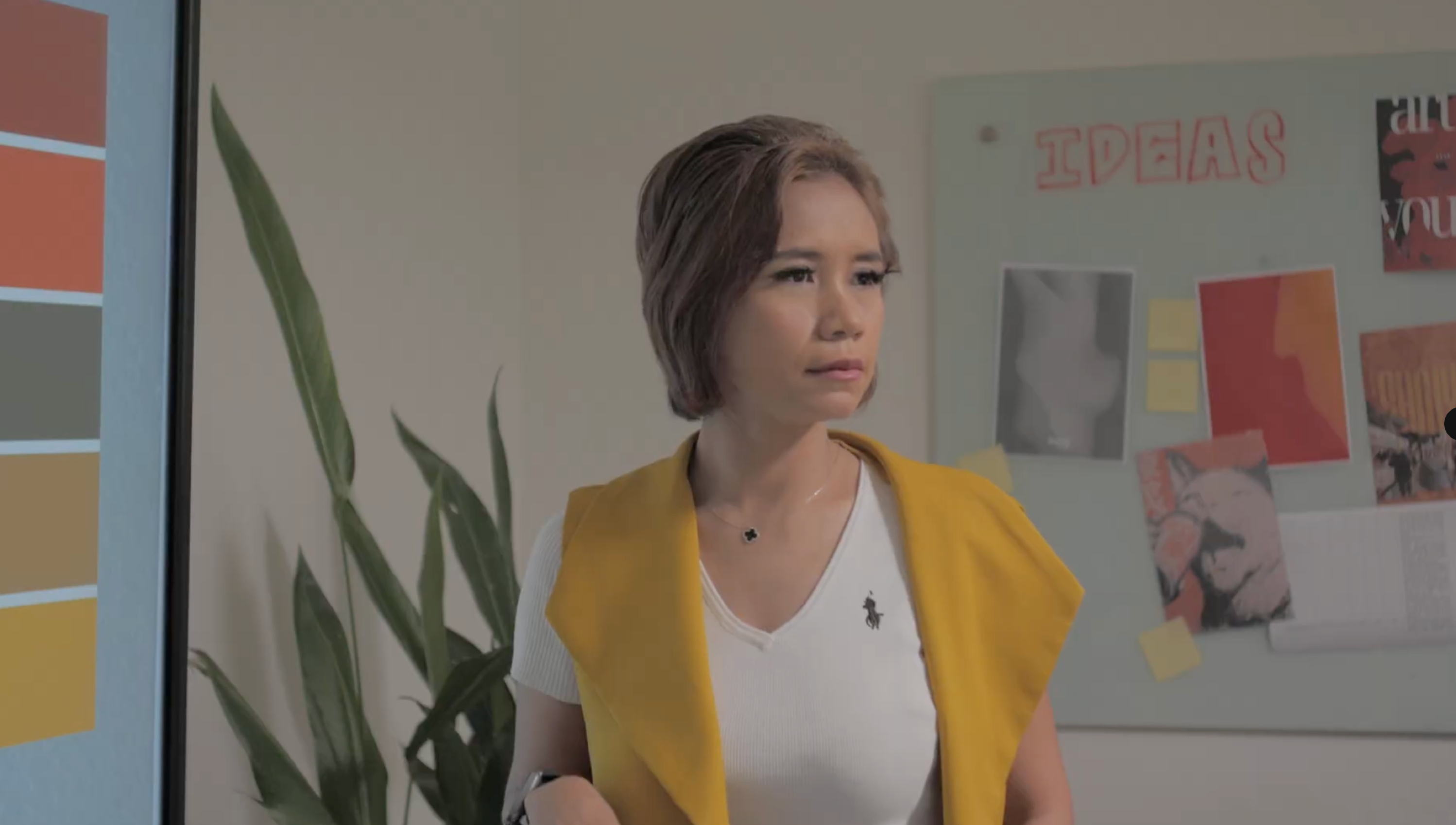
Selamatkan perutmu sebelum drama lapar menyerang
A busy workday. A missed meal. Then hunger takes over. This Lanana commercial turns a familiar office moment into a lighthearted story about making time to eat.
I developed the campaign concept and creative direction around that “hunger drama,” using humor to introduce Lanana as a convenient meal for a packed day.
Development
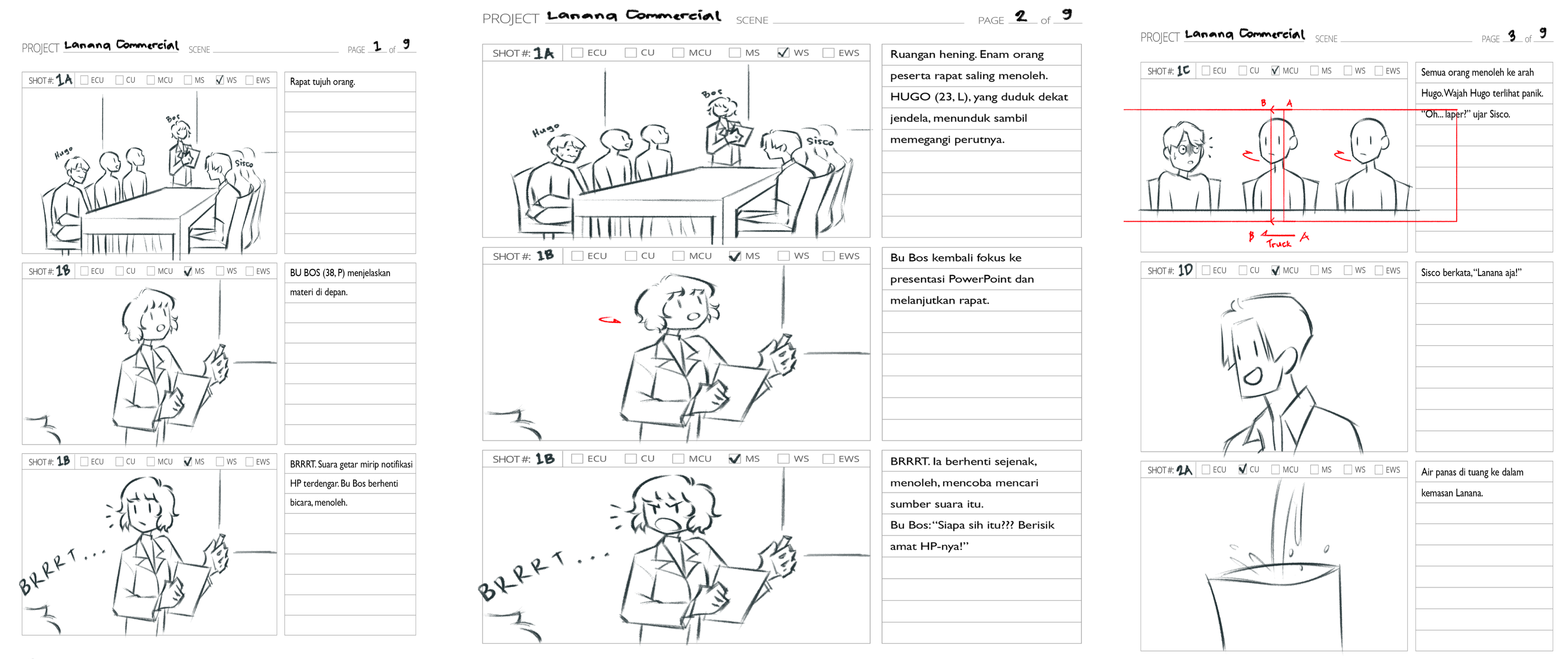
The storyboard translated the campaign concept into a shot-by-shot plan. It gave the client and production team a shared reference for the story, pacing, and visual direction.
Each frame mapped out the action, camera angle, and transitions between live footage and motion graphics. It also identified lighting and prop needs before the shoot.
Fifteen Markets. One Way to Read Them.
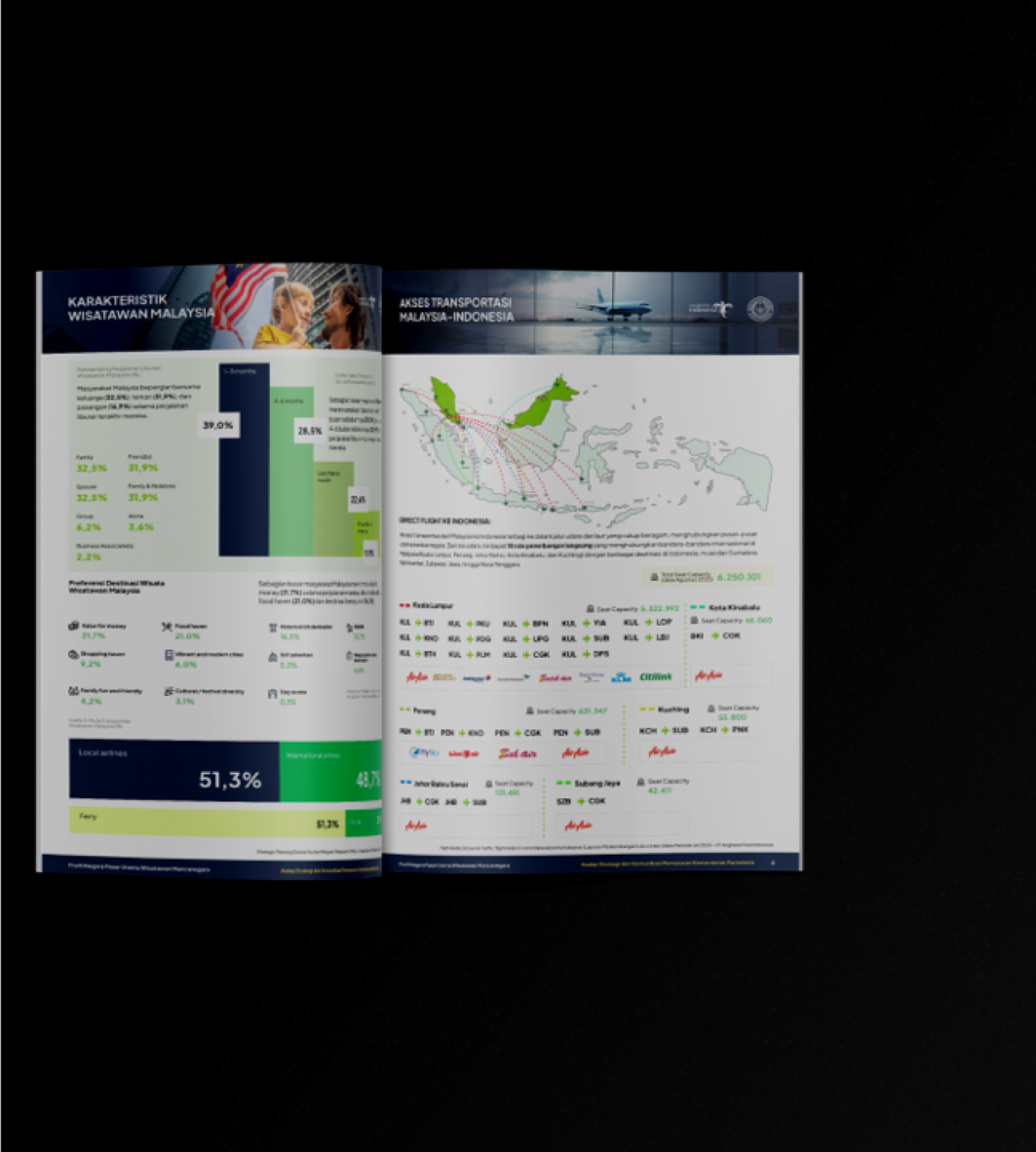
Wonderful Indonesia’s country profiles bring together tourism data from fifteen international markets. The challenge was to help government stakeholders navigate detailed information and compare markets.
A shared editorial structure organizes visitor characteristics, travel patterns, and market context. Consistent typography, charts, and page layouts make each profile familiar while preserving the differences in the data.
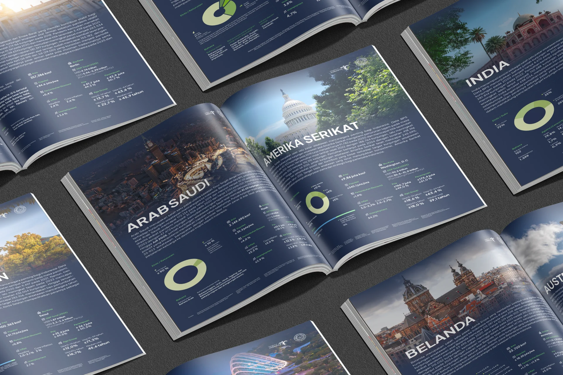 Country Profiles / Editorial Spreads
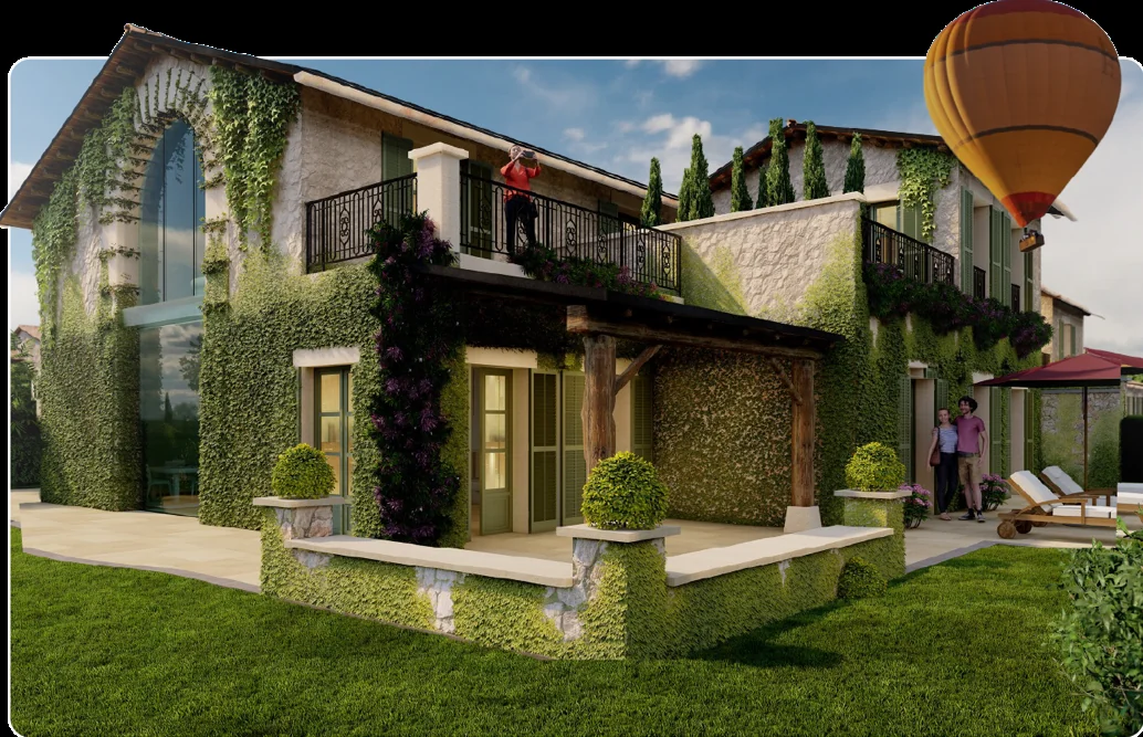
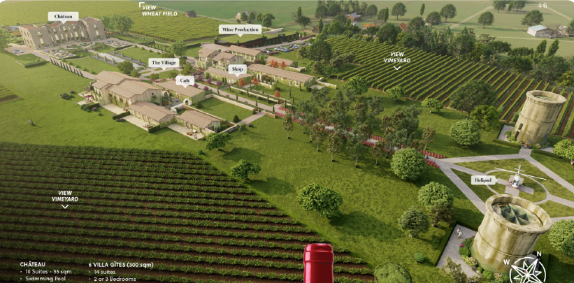
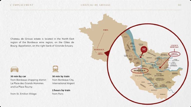
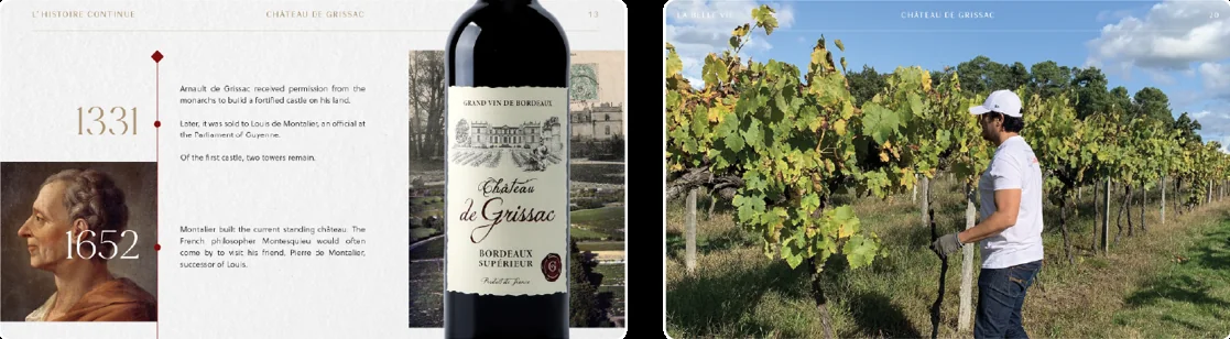
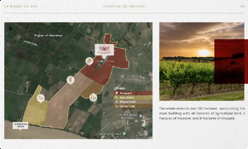
The Story Behind the Estate
Château de Grissac’s sales presentation brings together the history, land, and potential of a vineyard estate. Archival records, maps, and photography needed to tell a coherent story for prospective investors.
The deck moves from heritage and location to the property itself, giving each stage a clear visual hierarchy. The layout balances the estate’s character with the detail an investment conversation requires.
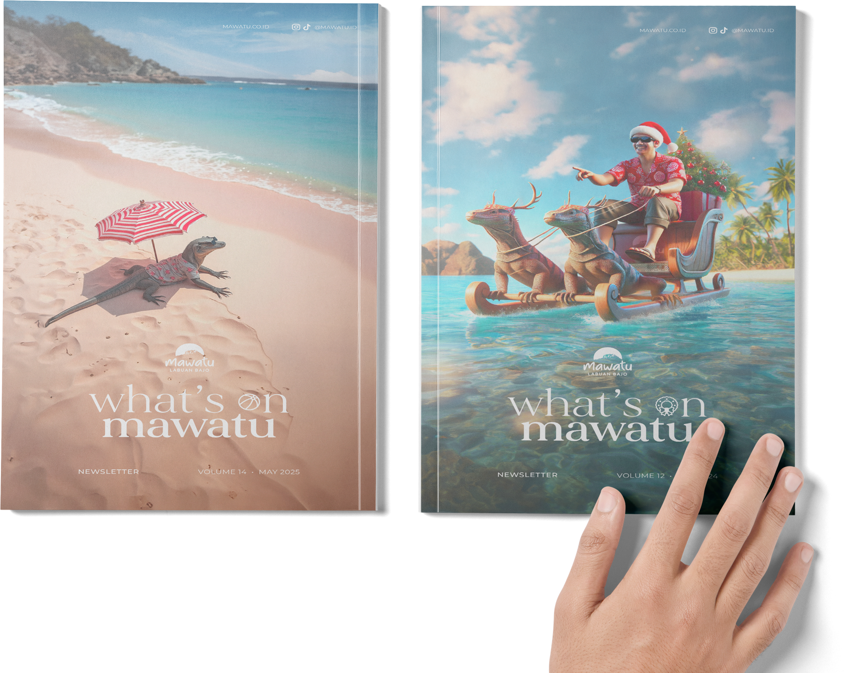
A Destination, One Issue at a Time
Mawatu’s newsletter keeps stakeholders and partners informed about the destination. Each issue brings together development updates, business insight, and stories from the brand.
A recurring editorial structure gives the publication continuity, with room for each issue’s lead story. Clear hierarchy and considered image placement help readers move between quick updates and longer features.
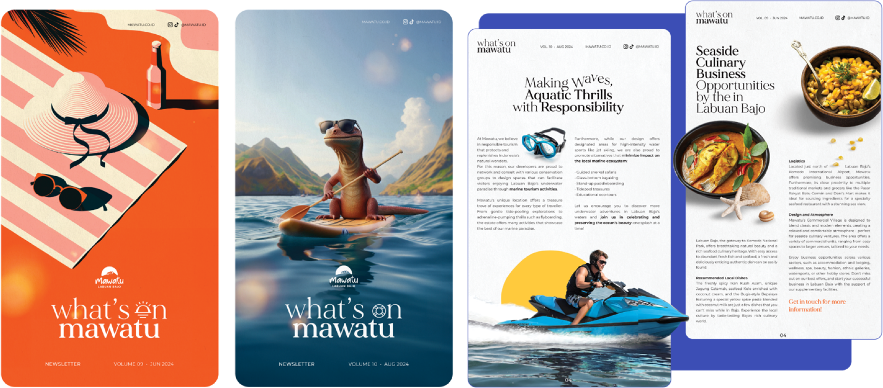 Newsletter Editions / Click to Read →
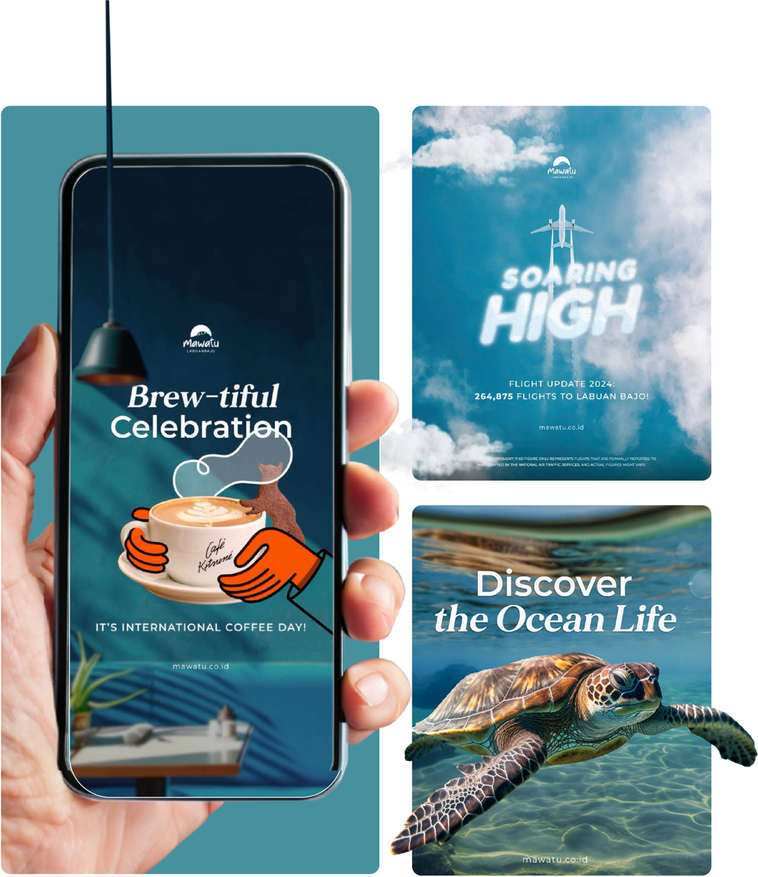
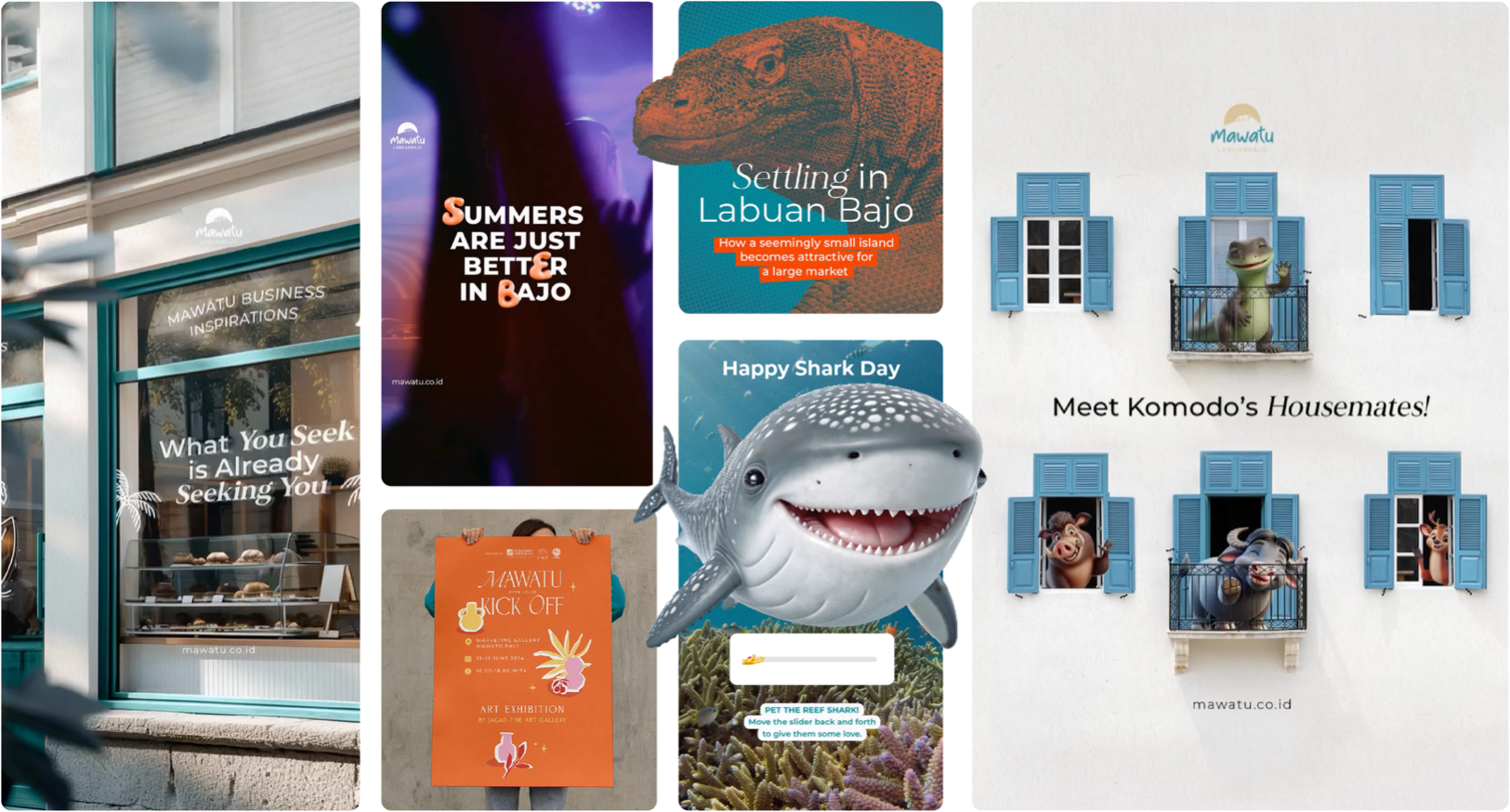 Social Media / Selected Posts
Good Coffee. No Small Talk.
Stew Yew is a casual coffee and pizza eatery in Sudirman, Jakarta. Its identity needed to feel direct and easygoing, with a mark that works across a busy café’s everyday materials.
A bold wordmark and playful voice carry through cups, menus, packaging, and signage. The system keeps the brand recognizable from the first order to the takeaway box.
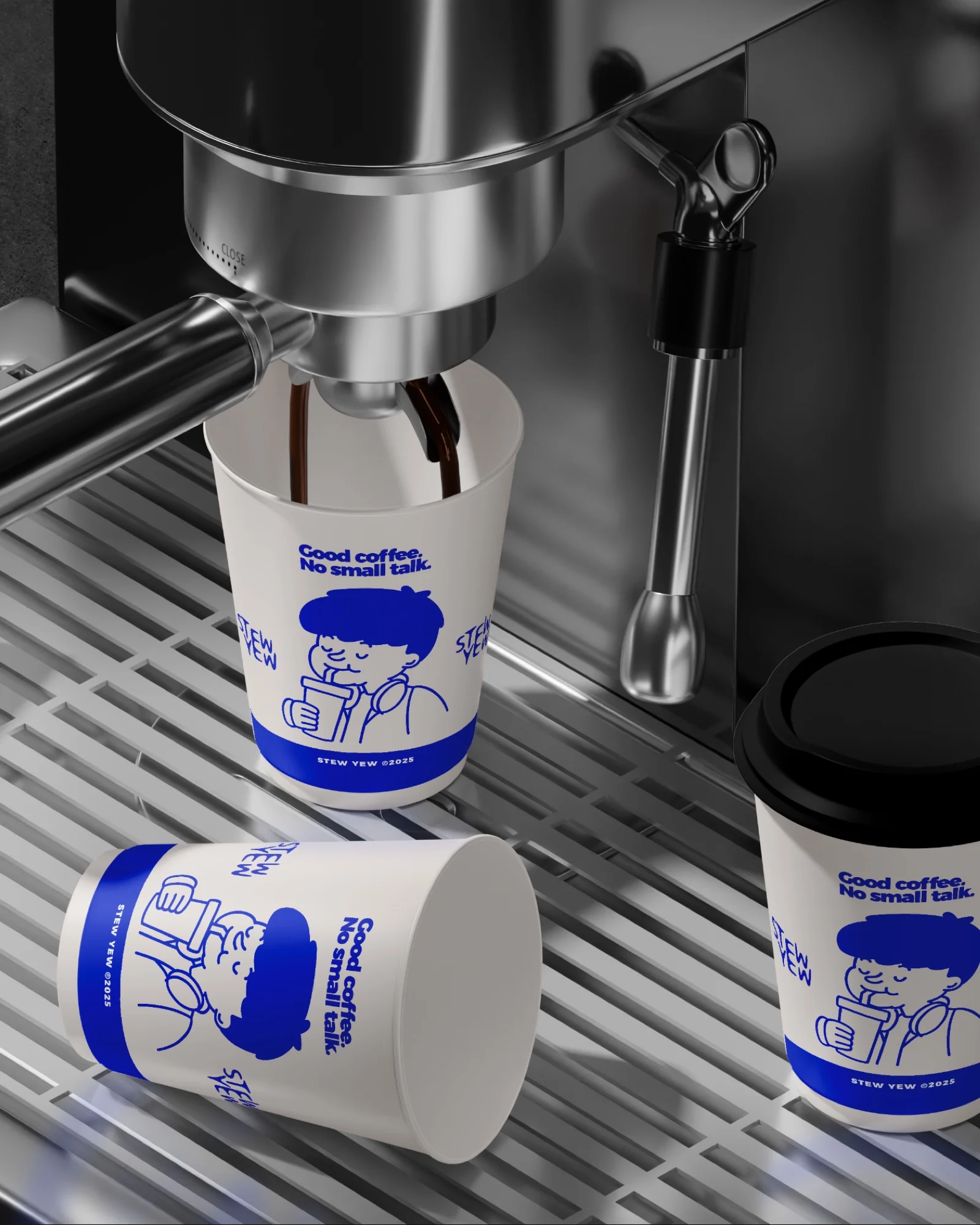 Brand World
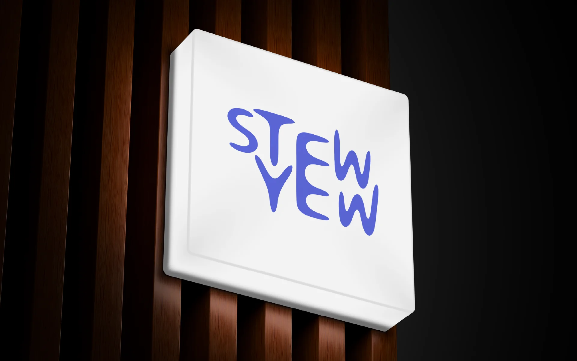 Signage
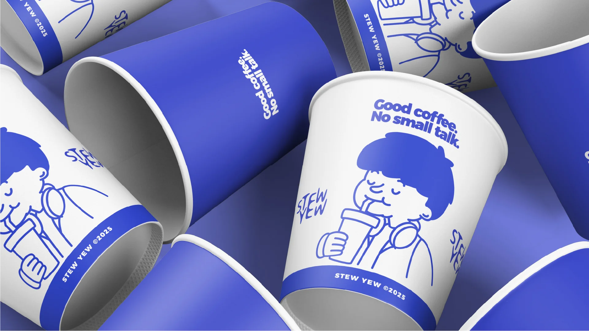 Meet the Regular
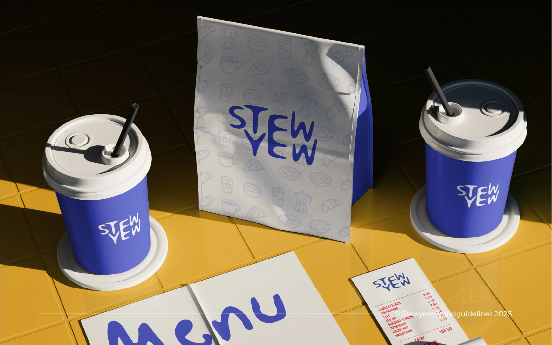 Flat Lay
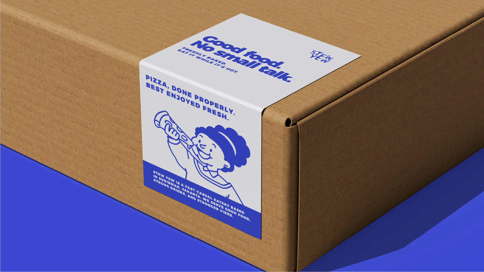 Packaging
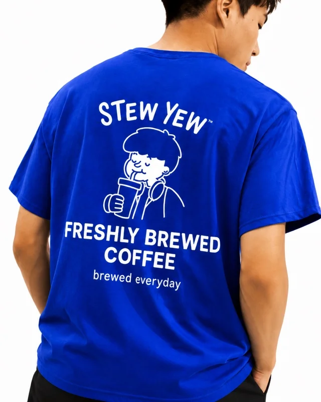 Merch
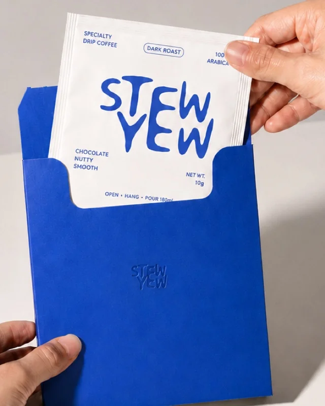 Drip Coffee Sachet
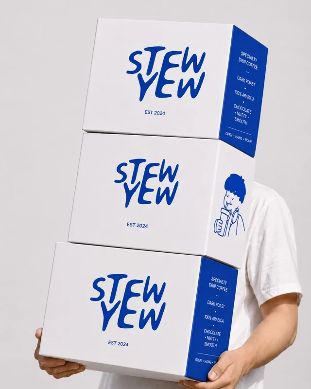 Packaging
Familiar Food. A Distinctive Welcome.
Kedai Bibi Lin brings Hainanese chicken rice and Peranakan influences to a modern kopitiam. The identity needed to feel welcoming to students, office workers, and families alike.
The visual direction brings that warmth into the signboard, uniforms, and takeaway packaging. A consistent mark and supporting graphics give the small, everyday details a shared character.
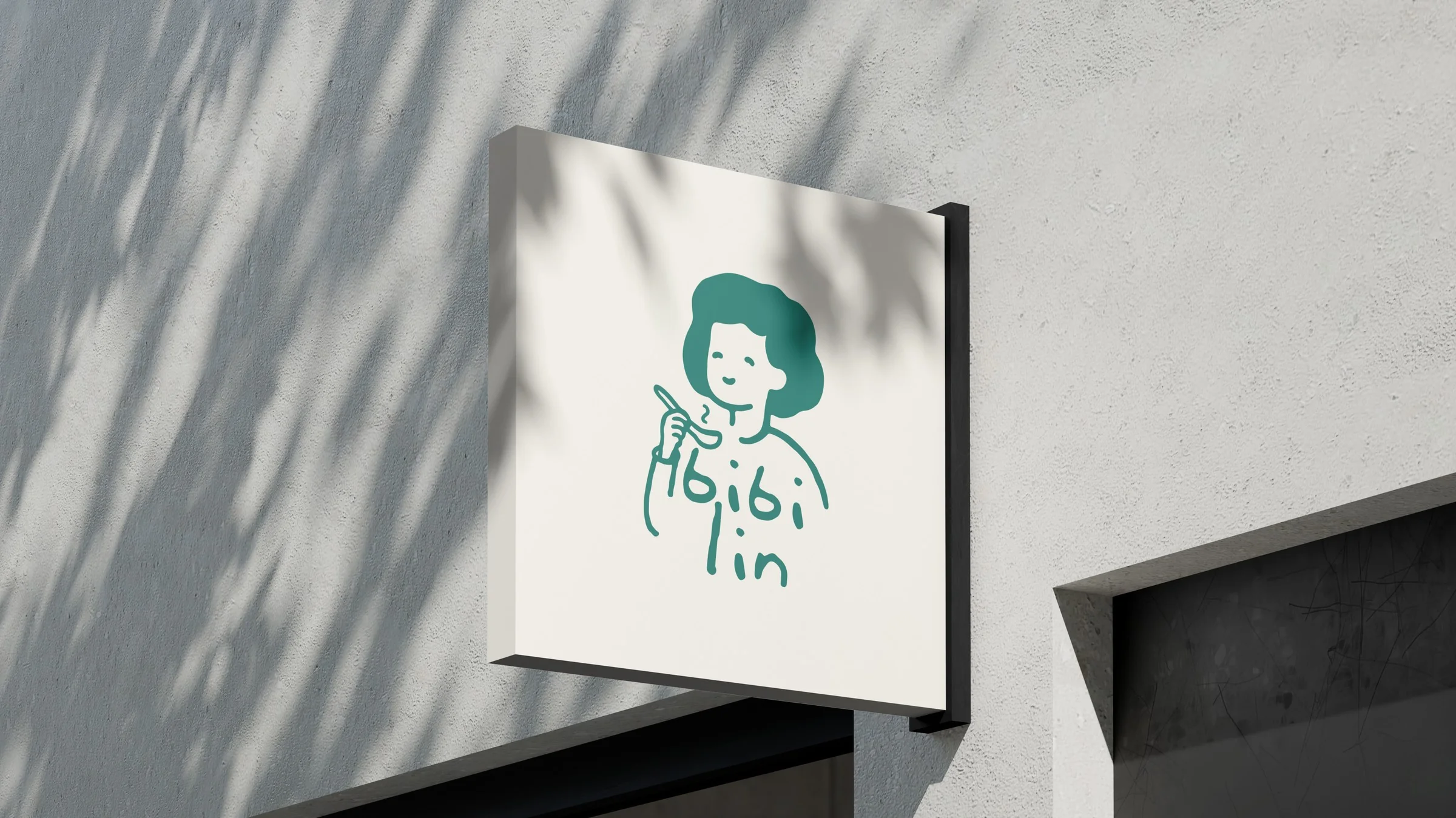 Signboard Mockup
 Logo Mark
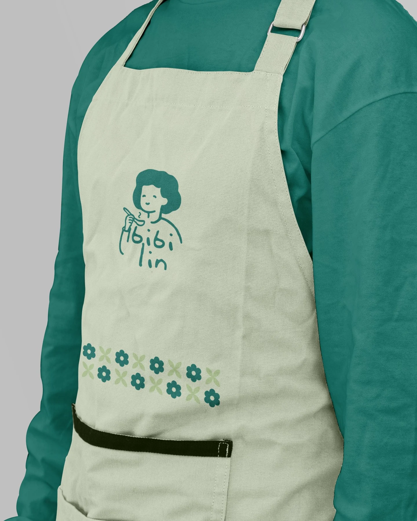 Apron
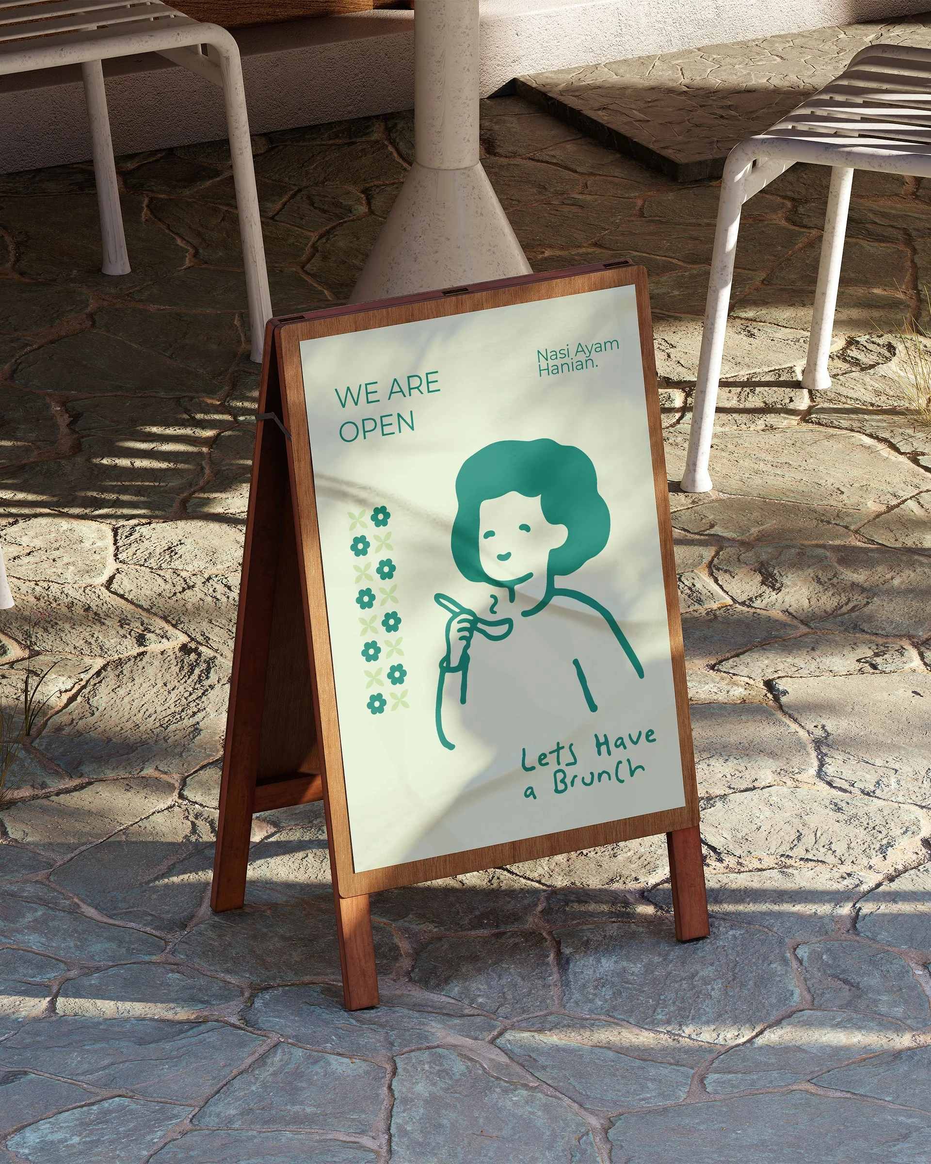 Standee Sign
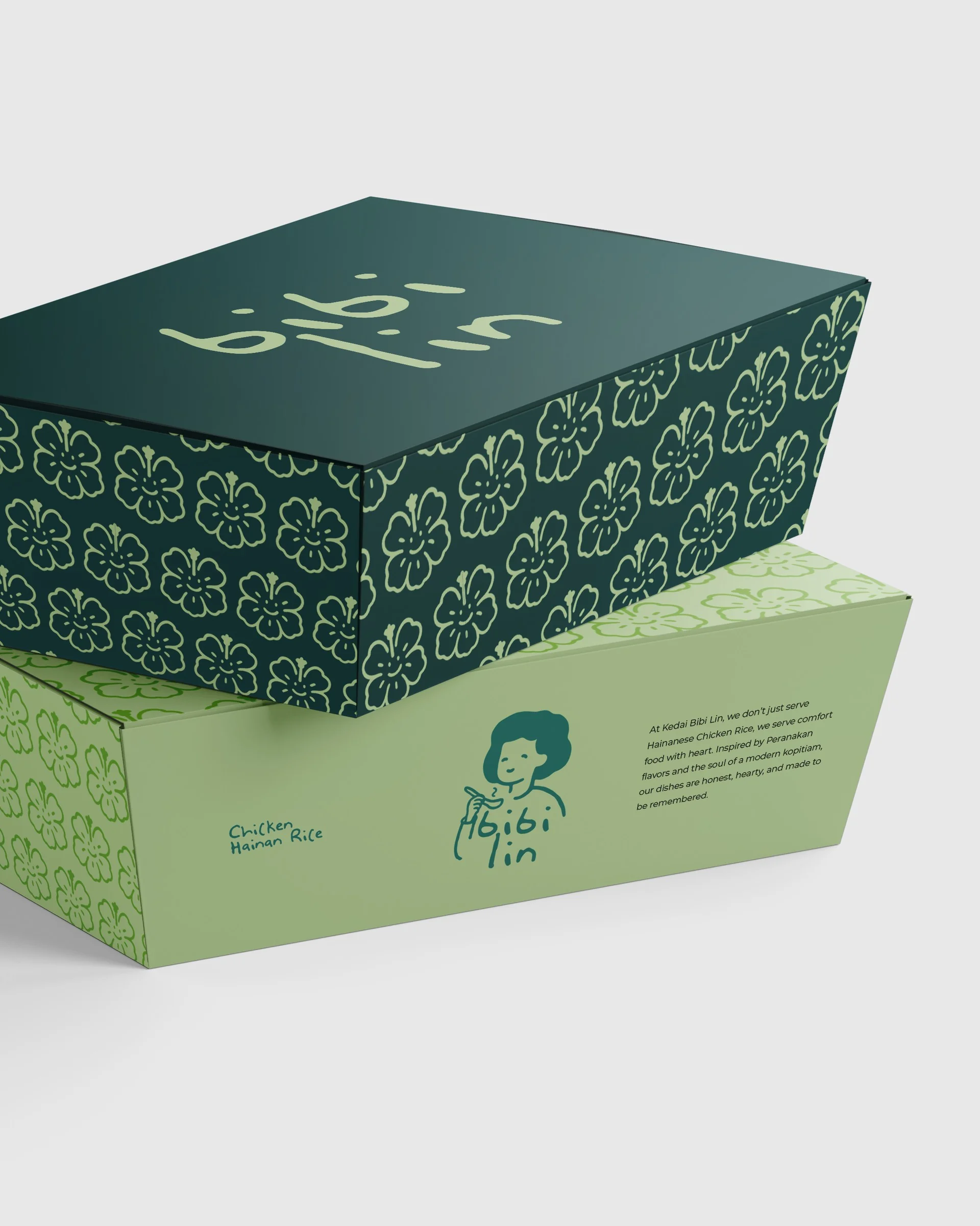 Packaging
Five Characters. One Distinctive Spirit.
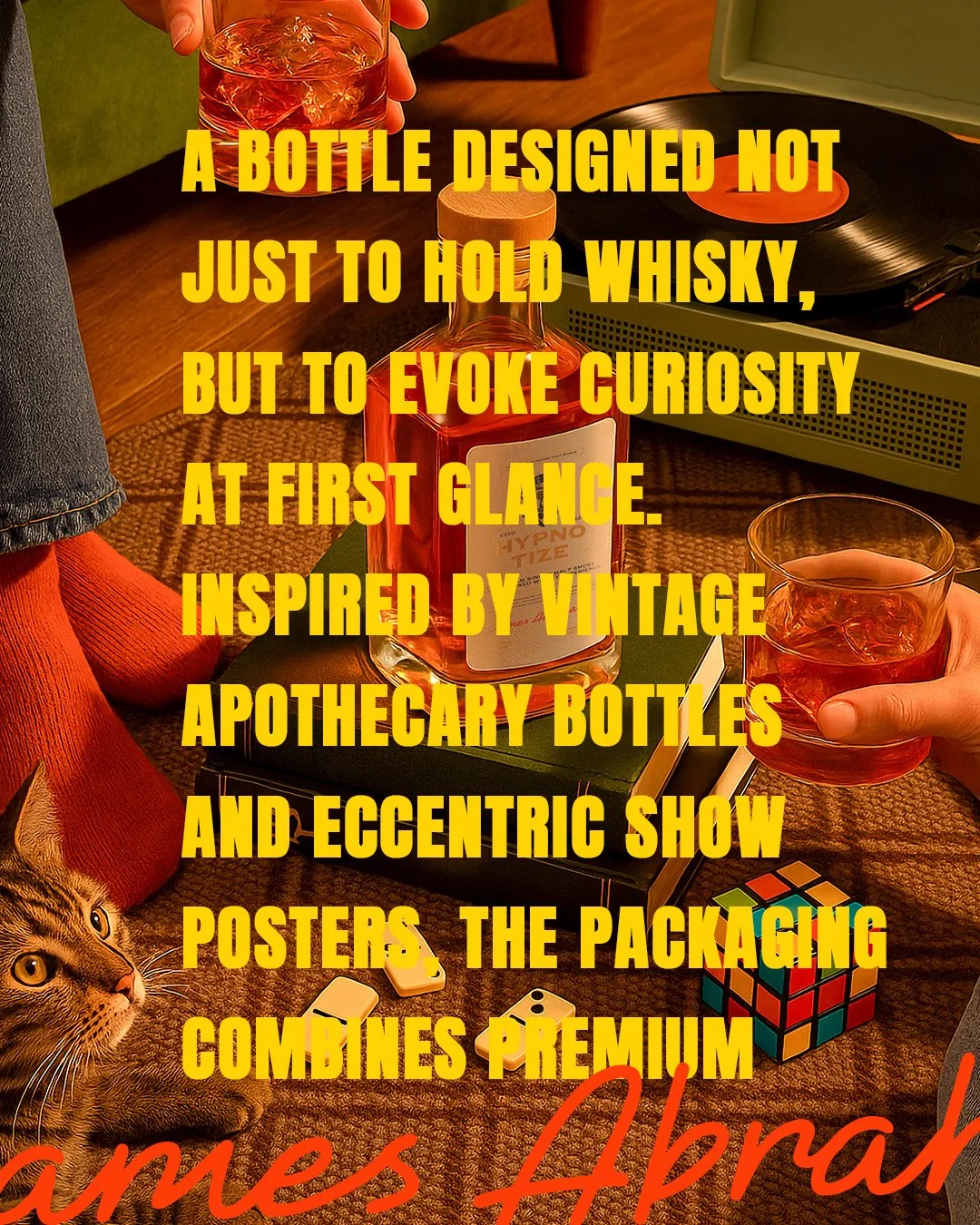
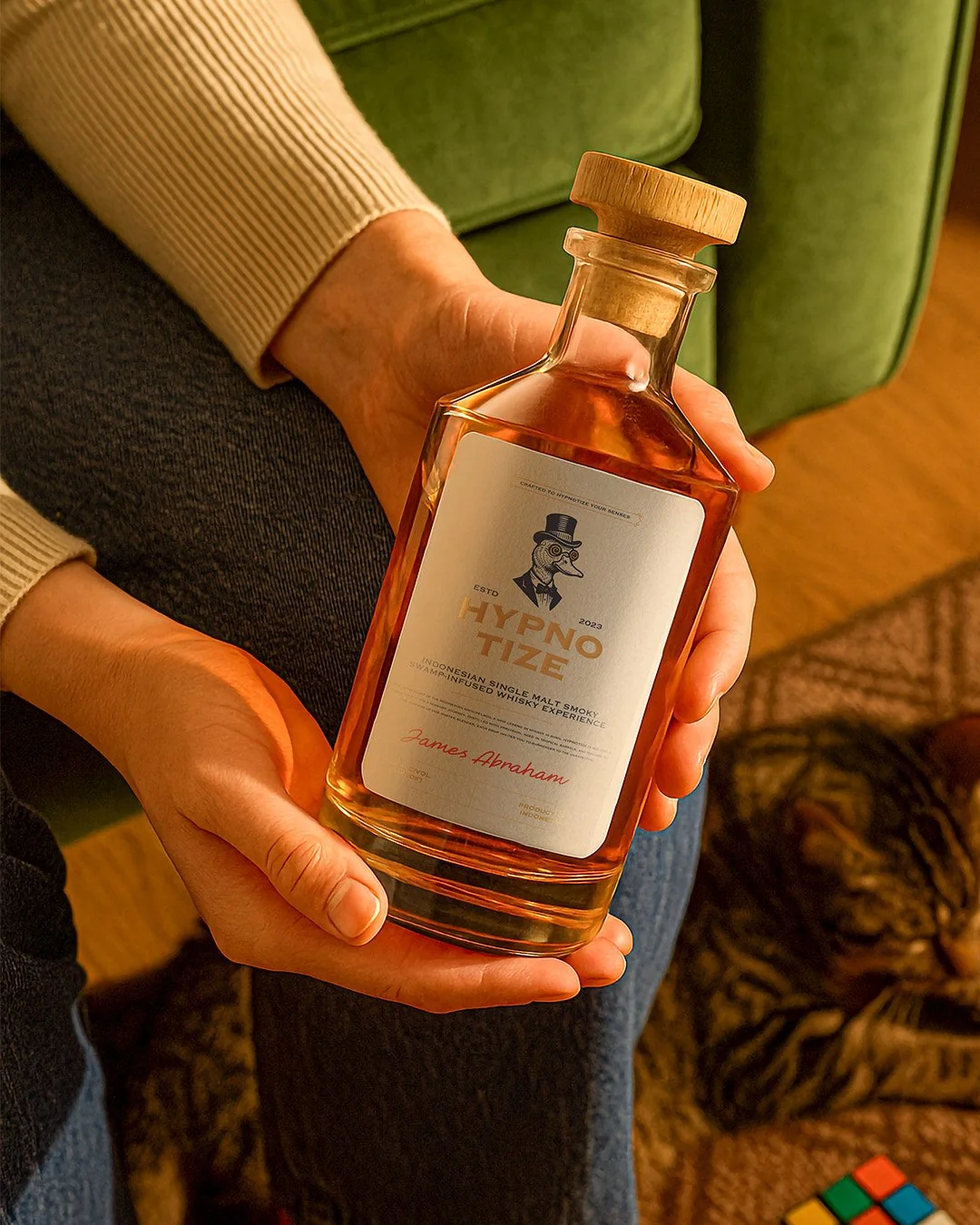
Hypnotize is an Indonesian artisan single malt whisky. The brief called for a brand and packaging identity that gives the range a distinctive character, with five individual marks at its center.
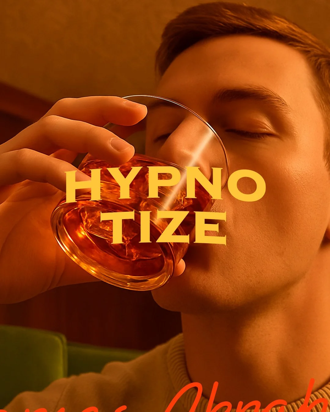
A shared label system holds the range together while letting each character stand apart. Packaging and lifestyle imagery extend the identity from the bottle into the wider brand experience.
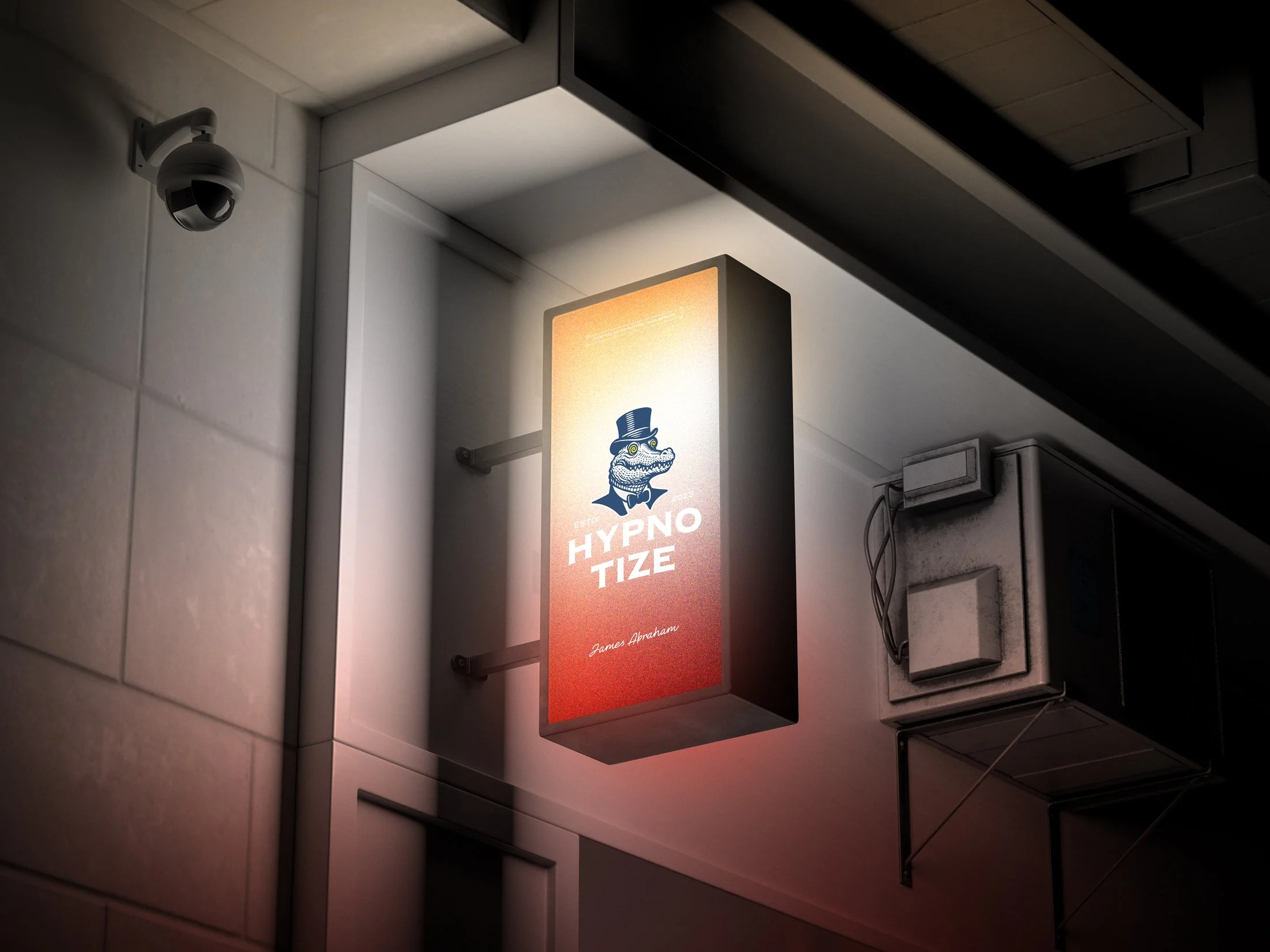 Signage / Crocodile Crest
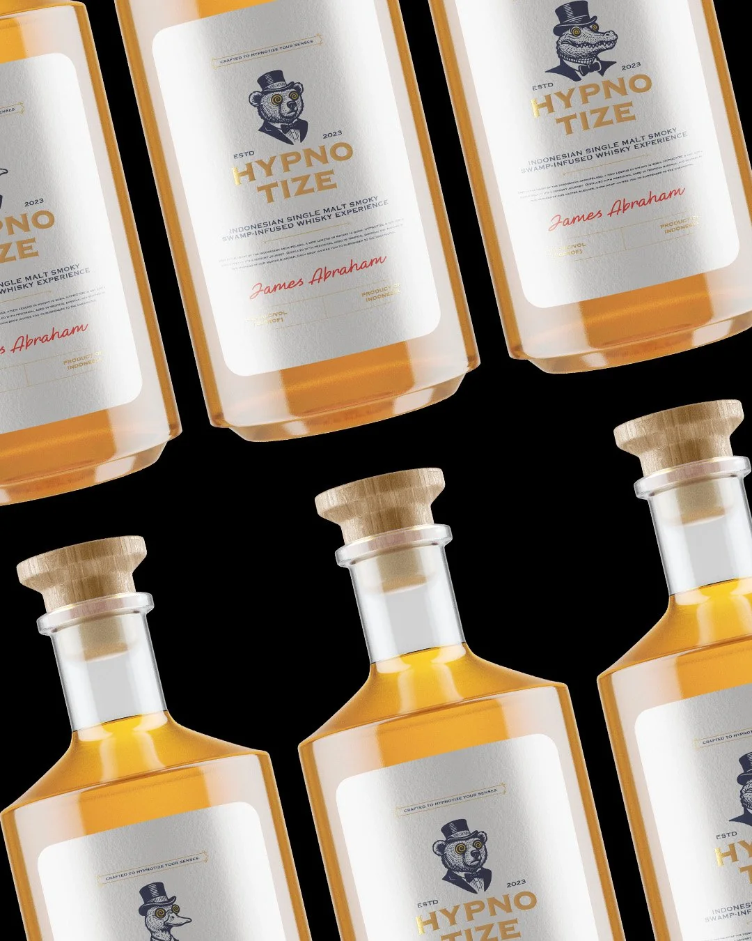 Character Bottles
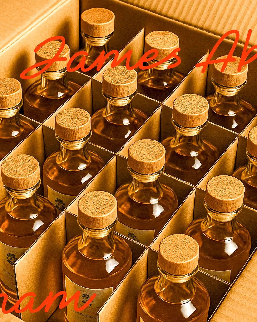 Packaging
 Social Post
 Social Post
 Social Post