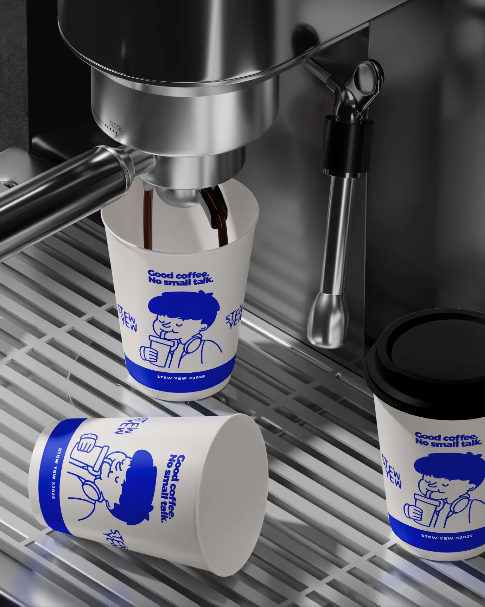
Stew Yew is a fast-casual eatery based in Sudirman, Jakarta. Good food, strong drinks, and stronger vibes, built for a neighborhood that moves fast and eats faster.
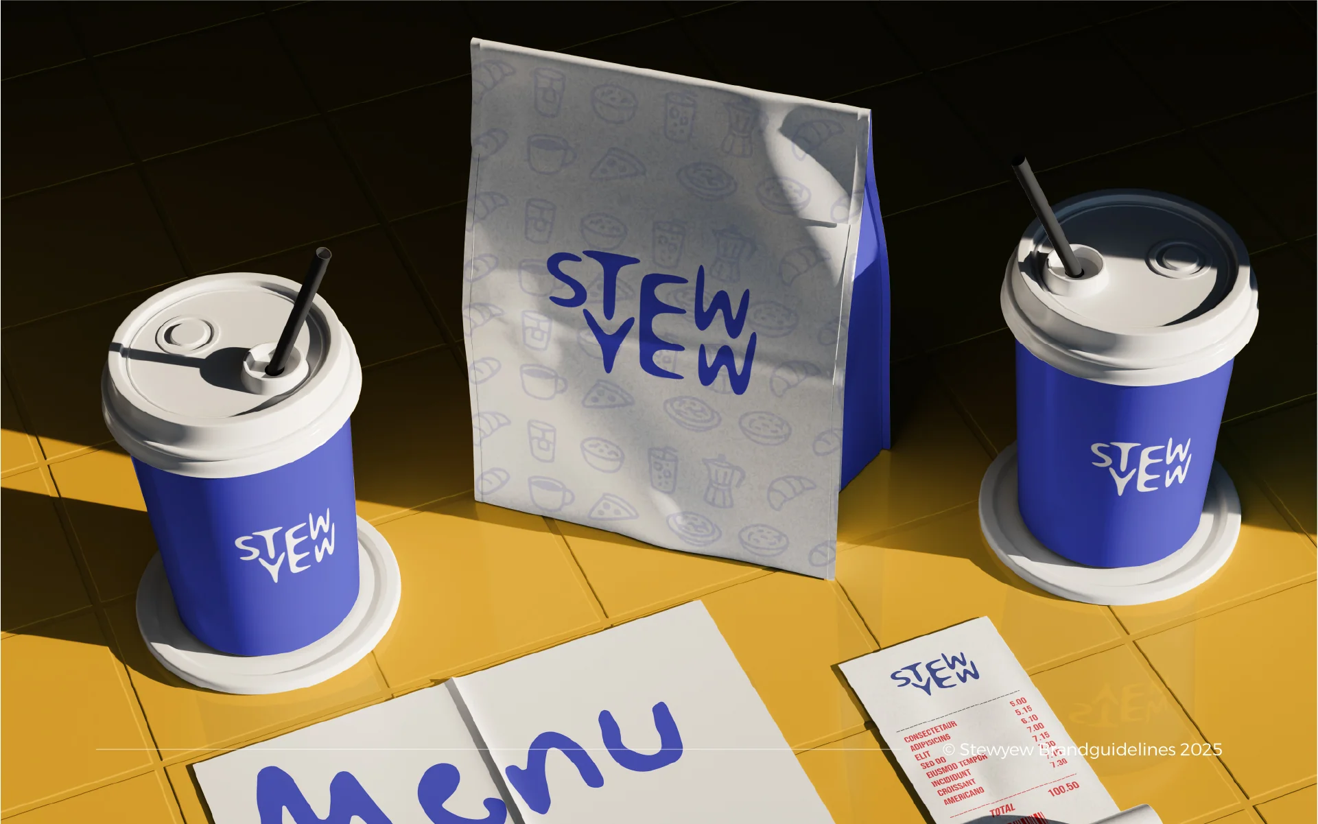
Coffee brewed to order, pizza done properly, and a menu that skips the fuss. The identity had to work at espresso-machine speed: legible on a cup lid, loud on a signboard, and calm enough for a receipt.
The Character
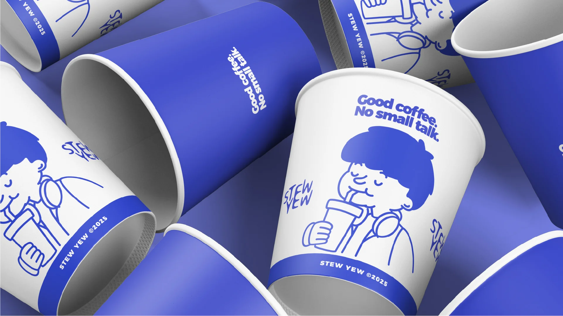
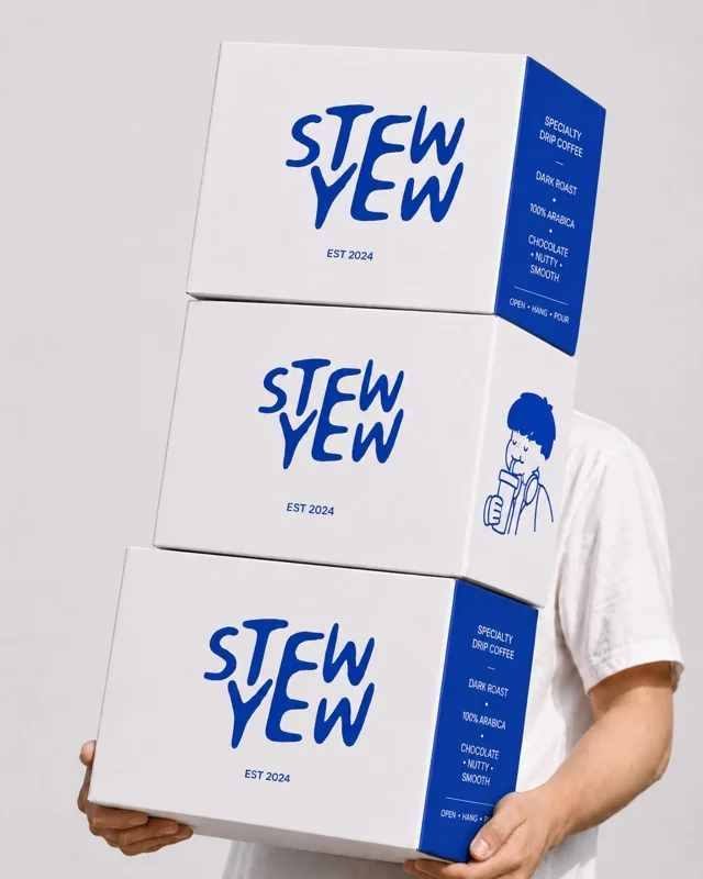
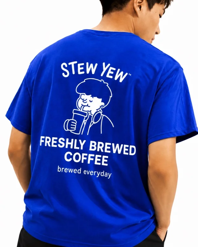
Beret on, eyes closed, straw in hand. He's mid-sip in every single appearance, on cups, boxes, and packaging alike, because that first sip is the whole point.
He doesn't perform for the camera and he isn't chasing a conversation. He's simply enjoying the drink in front of him. Good coffee. No small talk.
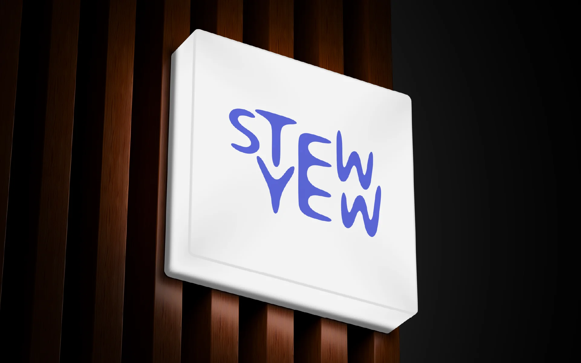
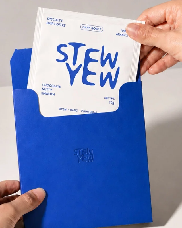
The two-line stack of "STEW" and "YEW" is deliberately loose and uneven, like it was marker-drawn on a cup in one go. Give it generous breathing room so the letterforms stay legible at small sizes, from a lid sticker to a signboard.
Brand Strategy
Says what it means in three words or less. No jargon, no over-explaining.
Eyes closed, mid-sip, unbothered. It doesn't need to perform to prove it's good.
Uneven marker lettering and loose line art keep it feeling human, not corporate.
Built for a quick order and a fast turnaround, without feeling disposable.
Deep, clean, and just slightly quirky. It carries the logo, dominates the signage, and grounds every layout it touches.
#3947D1Neutral, but never boring. A backdrop built to make everything else on the page hit harder.
#232428Custom hand-lettering built specifically for the "STEW YEW" mark. Loose, uneven, and drawn like it was written straight onto a cup, never used outside the logo itself.
Carries the tagline, menus, and fine print on packaging. Shown below in Poppins as a close, freely-available stylistic reference to the heavy rounded sans used on cups and boxes.
Good coffee.
ABCDEFGHIJKLMNOPQRSTUVWXYZ
abcdefghijklmnopqrstuvwxyz
0123456789
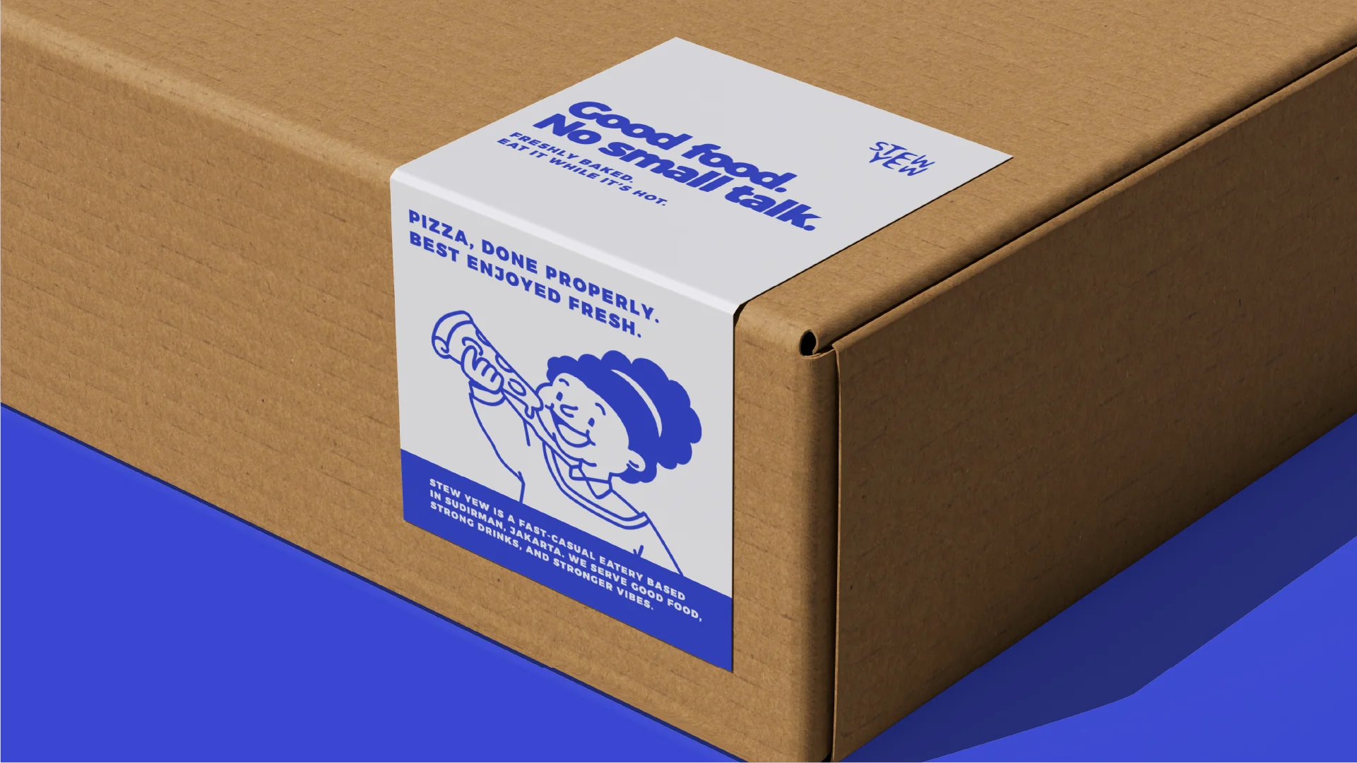
The tagline flexes across every touchpoint: "Good coffee, no small talk" on cups, "Good food, no small talk" on the pizza box. Same rhythm, same deadpan confidence, every time.
Next Case Study