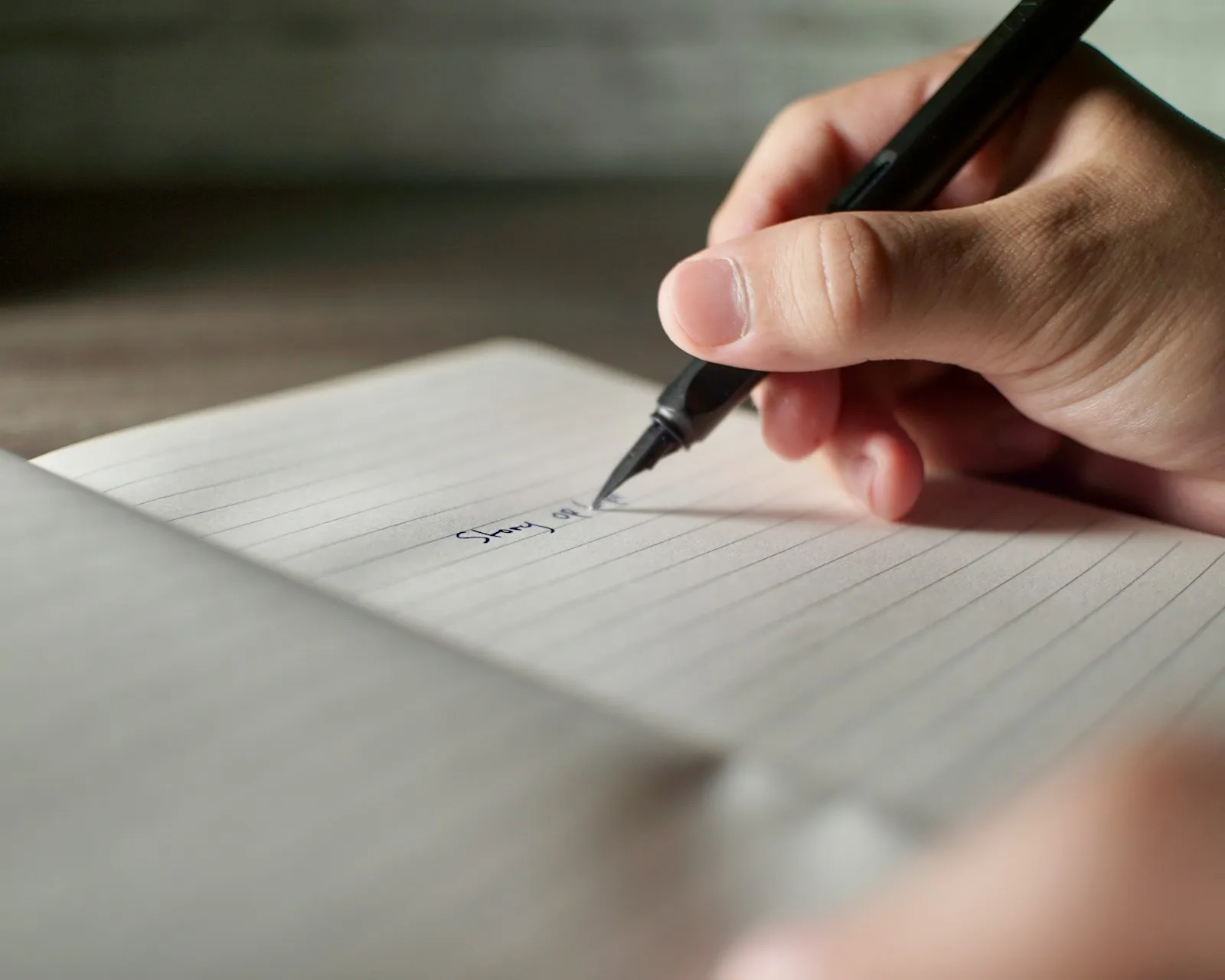
Photo via Unsplash
Photo via Unsplash
For years my process looked like everyone else’s. Open Figma, build a nice layout, fill it with lorem ipsum, and leave a note that says “copy to follow.”
The copy always did follow, and it almost never fit. Headlines were too long for the space, buttons needed two lines, and the whole page had to be rearranged at the last minute.
Note. Lorem ipsum comes from a scrambled passage by Cicero. Two thousand years old, and still saying nothing.
So I flipped the order. Now I write first, and design around what I actually need to say.
Design first
Words first
¶ 01 Placeholder
Lorem ipsum makes every layout look balanced because it was never meant to say anything. Real copy is messier. It has a point of view, and sometimes that point of view is weaker than you thought.
Writing first forces me to answer the uncomfortable question early. What are we actually trying to tell people here? If I cannot write it in a sentence, no layout is going to save it.
Note. Quick test: read the headline out loud. If it could belong to any company, it belongs to none.
Lorem ipsum
Lorem ipsum dolor sit amet
Consectetur adipiscing elit, sed do eiusmod tempor incididunt.
Lorem ipsumLooks finished. Says nothing.
¶ 02 Hierarchy
Once the copy exists, the design almost tells you what to do. The most important line becomes the headline. The proof becomes the supporting section. The thing people must do next becomes the button.
Instead of guessing where things go, I am arranging content that already has an order of importance.
Note. Number your lines before you open Figma. The numbers become your hierarchy.
In the copy
On the page
Restock your café before you open.
Delivered by 7am, from 40 suppliers you can trust.
¶ 03 Video
I learned this most clearly while making a showreel. I wrote and recorded the voiceover first, then built the visuals to follow its rhythm.
The edit came together much faster, and the final piece felt intentional rather than stitched together. Since then I use the same approach for social content, presentations and even packaging.
Note. Record a rough voiceover on your phone. It does not need to sound good, it needs to set the pace.
Showreel edit
Shot 01
Close up
Shot 02
Wide
Shot 03
Logo
“Every brand starts with something to say.”
¶ 04 Drafts
This does not mean every word has to be perfect before design starts. My first drafts are often clumsy. The point is that they are real enough to react to.
A clumsy sentence still tells me its length, its tone and its purpose, which is more than a gray block of fake Latin ever will.
Note. Clumsy is fine. Empty is not.
Draft
1 / 3Headline slot
Length
Fits the slot
Tone
Point
¶ 05 Your turn
Before opening your design tool, write the headline, the one sentence that explains the offer, and the call to action. That is three lines of text, and it might take ten minutes.
Note. Ten minutes. Set a timer if you have to.
Your three lines
Nothing is saved. It only lives on this page.
Your headline
The sentence that explains why it matters.
Your actionThe layout you build afterwards will feel clearer, because you finally know what it is supposed to say.
Keep Reading